
Logos don’t build loyalty. Symbols do. The distinction matters more than most brands realize.
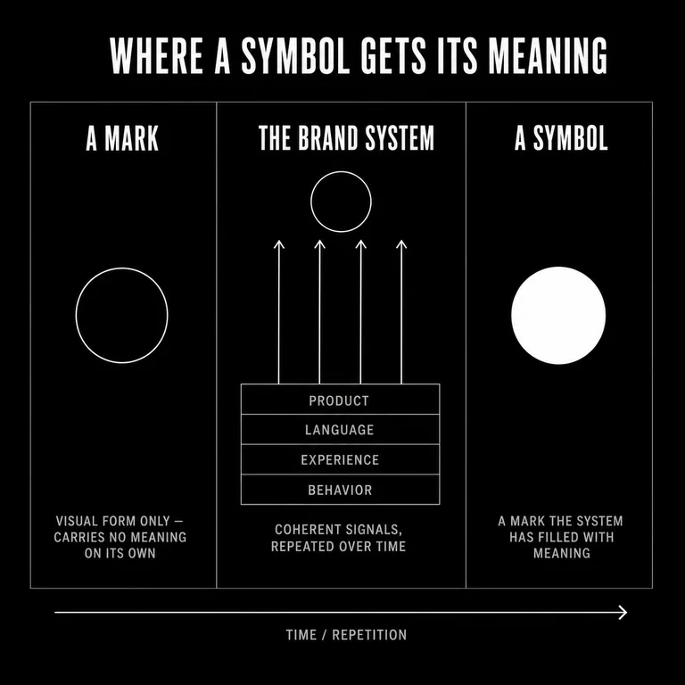
A logo is a mark. A symbol is a carrier of meaning. When a brand gets this right, the visual elements stop being decoration and start doing structural work—encoding values, signaling belonging, reinforcing the same story across every touchpoint. When a brand gets it wrong, it accumulates marks that look coherent but say nothing.
This article explains what symbolism actually does inside a brand system, why it drives loyalty at a deeper level than recognition alone, and how to choose and deploy symbols that hold meaning over time.
What You’ll Learn
- What distinguishes a symbol from a logo
- How symbols create emotional resonance and community, not just recognition
- Why cultural coherence matters more than visual originality
- How to evaluate whether your existing symbols are working
- The most common mistakes brands make with symbolic branding
What Is Symbolism in Branding?
Symbolism in branding is the use of visual elements—logos, colors, shapes, motifs—to represent values and meaning that cannot be stated directly. A symbol works because it compresses complex meaning into a form that audiences can recognize, remember, and feel without explanation — the same move humans have made since the first symbolic marks appeared tens of thousands of years ago.
The key word is meaning. Symbols are not illustrations of a brand promise. They are carriers of it. The Nike swoosh doesn’t describe motion—it embodies a posture toward effort and competition that the brand has spent decades reinforcing through every signal it sends. The symbol works because the meaning behind it is real and consistent. Strip away that consistency, and the mark becomes just a checkmark.
Brand symbols operate below the level of conscious processing. The psychologist Robert Zajonc made this case decades ago in his 1980 paper for American Psychologist, “Feeling and Thinking: Preferences Need No Inferences,” arguing that affective reactions can form ahead of, and independently of, conscious judgment. Symbols exploit this by delivering emotional cues faster than language can. This is why a color palette can make a brand feel trustworthy or chaotic before a single word is read.
Key takeaway: A symbol is not a logo with ambitions. It is a compressed signal that carries meaning because the brand has invested in making that meaning real.
Why Do Symbols Drive Loyalty, Not Just Recognition?
Brand loyalty is not the result of familiarity. It is the result of identification. Customers become loyal when they see themselves reflected in a brand’s meaning—and symbols are how that meaning is transmitted without words.
Recognition is a low bar. Most people can identify a dozen fast food logos. Very few feel loyal to them. The brands that generate genuine loyalty—the ones whose customers defend them, recommend them unprompted, return across price points and life changes—have achieved something more specific. They have made their symbol a point of identity for the people who choose them.
Harley-Davidson is the clearest case study. The bar-and-shield logo is not remarkable as a piece of design. What makes it powerful is what it represents to the community that has built up around it: a particular stance toward freedom, rebellion, and belonging. Customers don’t just buy motorcycles. They join something. The symbol marks membership.
This mechanism works across categories, but only when the brand has done the underlying work. A symbol can only carry the meaning that exists in the rest of the system. Loyalty follows meaning. And meaning requires coherence across every signal a brand sends—product, language, experience, and symbol alike.
We see this in our own work. A client came to us convinced they needed a new mark. The existing one felt tired, and a redesign seemed like the obvious fix. But the mark was fine. It was legible, distinctive, well-built. What had gone quiet was the system underneath it. The language had drifted. The experience no longer matched what the brand claimed. The signals had stopped agreeing with each other. The symbol had stopped meaning anything, because nothing coherent was left for it to carry.
So we didn’t redesign it. We rebuilt the coherence behind it: what the brand stood for, how it showed up, what each signal was supposed to say. We left the mark in place. The same symbol started to read as meaningful again. The mark hadn’t changed; the system behind it had finally started to agree with it. That is the pattern we see most often. When a symbol stops landing, the mark is rarely the problem. The coherence behind it is.
Common failure mode: Brands attempt to build loyalty through symbol design without building the meaning the symbol is supposed to represent. The result is a polished mark that audiences find forgettable because there is nothing behind it.
Key takeaway: Symbols build loyalty by enabling identification, not just recognition. Customers become loyal to what a brand means, and symbols are how meaning travels.
How Do Symbols Create Emotional Connection?
Symbols create emotional connection by encoding values into forms that trigger feeling before thought. The emotional response comes first. The rational justification follows.
This sequence matters. It means brand symbols operate most powerfully at the level of felt sense—the immediate, pre-verbal impression a brand makes. Color, shape, form, and cultural association all carry weight here. A shield shape reads as protection. A fluid curve reads as movement. A serif typeface reads as heritage. None of these associations are arbitrary; they are built from accumulated cultural meaning that audiences carry with them.
The brands that deploy this well understand that emotional connection is not engineered through clever design alone. It is earned through sustained alignment between what the symbol promises and what the brand delivers. Apple’s apple doesn’t evoke simplicity and elegance because of its shape. It evokes those qualities because Apple has reinforced them through product design, packaging, retail experience, and communication for decades. The symbol has accumulated meaning through consistent behavior.
Starbucks provides a useful contrast. The siren logo draws on maritime mythology and an idea of adventurous, exploratory pleasure. For years, that meaning held because the brand delivered on a specific experience: a third place that was neither home nor office, anchored by a ritual. As the brand has scaled and standardized, the gap between what the symbol implies and what the experience delivers has grown. The symbol is still striking. The emotional connection is thinner.
Key takeaway: Symbols earn emotional resonance through consistent alignment with the brand’s behavior, not through design quality alone.
What Makes a Brand Symbol Effective?
An effective brand symbol is legible, distinctive, culturally coherent, and semantically loaded. All four conditions matter. Most symbols achieve two or three.
Legibility means the symbol communicates quickly across contexts and sizes. Distinctiveness means it does not blur into category conventions. Cultural coherence means it carries meaning that is appropriate and consistent within the brand’s target community—and does not carry unintended meaning elsewhere. Semantic load means it connects to something real about what the brand stands for.
The last criterion is the hardest to achieve because it depends on factors outside design. A symbol cannot be semantically loaded by itself. It becomes semantically loaded through sustained use in contexts that reinforce its meaning. This is why well-established symbols resist redesign: the accumulated meaning is stored in the audience’s association, not in the mark itself. When Tropicana redesigned its packaging in 2009—removing the iconic orange-with-straw image—sales fell about 20 percent over the two months that followed, a roughly $30 million loss, as Advertising Age reported. The design team created something cleaner. They destroyed something irreplaceable.
| Element | Content |
|---|---|
| Term | Effective brand symbol |
| Plain definition | A visual element that is legible, distinctive, culturally coherent, and carries real meaning |
| Why it matters | Symbols that lack semantic load generate recognition but not loyalty |
| Common confusion | Design quality is often mistaken for symbolic effectiveness—a symbol can be beautiful and meaningless |
Key takeaway: Symbol effectiveness is a function of meaning, not aesthetics. Design quality helps, but it is not sufficient.
How Do You Choose the Right Symbols for Your Brand?
Choosing brand symbols requires understanding three things: what your brand actually means (not what you wish it meant), what your audience already associates with visual conventions in your category, and where you want to differentiate.
Start with meaning, not design. Before opening a design brief, define what the symbol needs to carry. What values is the brand built on? What is the emotional posture of the audience you are building for? What existing cultural associations—colors, shapes, forms, iconography—align with that meaning? This is a strategic exercise, not a creative one. Design comes after.
Then audit your category. Every market has visual conventions that have accumulated meaning over time. Financial services brands cluster around blues, shields, and geometric stability because those forms carry trust. Disrupting a category convention can signal difference—but only if you have the brand substance to back it up. Disruption without differentiation is just noise.
Finally, test for unintended meaning. Symbols carry cultural baggage that varies by geography, demographic, and context. A color that signals luxury in one market signals mourning in another. A shape that reads as dynamic in one culture reads as unstable in another. This is not a reason to choose only safe symbols—but it is a reason to test before you commit.
The practical sequence:
- Define the meaning the symbol must carry, in one sentence.
- Research visual conventions in your category and adjacent categories.
- Identify the specific emotional register you want the symbol to occupy.
- Commission design exploration within those constraints.
- Test for legibility, distinctiveness, and unintended associations across your key audiences.
- Commit to consistent deployment across every touchpoint.
Key takeaway: Symbol selection is a strategy problem before it is a design problem. Start with meaning; let design follow.
What Are the Most Common Mistakes in Symbolic Branding?
The most common mistakes fall into three categories: choosing symbols before establishing meaning, over-designing for novelty, and failing to deploy symbols consistently enough for meaning to accumulate.
Choosing symbols without meaning. This happens when brands treat symbol selection as a design challenge rather than a strategic one. The result is marks that are visually sophisticated but semantically empty. They may win design awards. They do not build loyalty.
Chasing originality at the expense of legibility. Original symbols are valuable, but only when they can be decoded. Abstract marks that require explanation to interpret are working against their own purpose. A symbol that needs a tagline to explain it is not doing its job.
Inconsistent deployment. Meaning accumulates through repetition. A symbol that appears differently across touchpoints—different colors, different proportions, different contexts—never builds the associations needed to become a true symbol. Coherence is not a design constraint. It is the mechanism through which meaning is built.
Redesigning prematurely. Brands redesign when they feel stale internally long before their symbols have lost power externally. The history of brand redesigns that destroyed accumulated equity is long. Before redesigning a symbol, audit what meaning the audience has built into the existing one. That meaning belongs to them, not to the brand.
Key takeaway: Most symbol failures are failures of strategy or consistency, not failures of design.
Conclusion
Symbols are not decoration. They are structural components of a brand system—points where meaning becomes visible, where belonging becomes legible, where abstract values take a form that audiences can hold onto.
The brands that build lasting loyalty through symbolism are not the ones with the most memorable marks. They are the ones whose marks have accumulated real meaning through sustained, coherent behavior. Design gets the symbol into the world. Coherence makes it matter.
If you are evaluating your own symbolic branding, start with a simple question: what does your symbol mean to the people who choose you? If the answer is clear, consistent, and aligned with what you intend—the system is working. If the answer is vague, inconsistent, or absent—the work is not design. The work is meaning.