

At Subverse we work on brand systems, not interiors. But the question designers ask about maximalism and minimalism is the one we ask about every brand we touch: does each element earn its place, or is it just adding noise? Treating them as opposing camps, where you pick a side and commit, misreads both. The more useful question is structural: what happens when you use one as a constraint and the other as a mode of expression?
The answer is a design approach that is neither sterile nor chaotic. It has visual depth without clutter, restraint without coldness. This article breaks down how minimalism and maximalism actually function, why blending them works, and how to do it without the space—or the project—falling apart.
What You’ll Learn
- How minimalism and maximalism differ as structural approaches, not just aesthetic preferences
- Why combining them produces more livable, more legible spaces than either extreme
- Practical techniques for layering, focal points, and intentional curation
- The most common failure modes and how to avoid them
What Is Minimalism in Design?
Minimalism in design is the discipline of removing everything that does not contribute to the central purpose of a space or object. It prioritizes function, clarity, and negative space. The goal is not emptiness—it is focus.
The defining characteristics of minimalist design are clean structural lines, neutral or monochromatic palettes (typically whites, grays, and warm beiges), and deliberate material choices where each element earns its place. Scandinavian and Japanese modernist traditions have done the most to define what minimalism looks like in architecture and interior design: uncluttered surfaces, natural light, and spatial breathing room.
What minimalism provides structurally is a legible foundation. It is easier to understand a space—what it is for, how it works—when there is nothing competing for attention.
Key takeaway: Minimalism is not an aesthetic of scarcity. It is an organizational principle. Remove what distracts. Keep what clarifies.
The same principle operates in brand systems. A brand built on minimalist discipline strips away competing signals until a single meaning registers. The question is the same one the designer asks of a room: does this element clarify or distract? In our work this is literal signal management. Every brand sends signals constantly — language, design, tone, cadence, what it chooses to leave out. Minimalism in branding is the discipline of ensuring those signals agree with each other rather than competing for attention.
What Is Maximalism in Design?
Maximalism is the design philosophy of abundance and accumulation, where richness of experience takes priority over spatial simplicity. It draws from multiple visual registers at once: color, pattern, texture, and historical reference. Ornamental movements like Art Nouveau, with its flowing botanical line and integration across every surface, are exactly the kind of source it returns to.
Where minimalism constrains, maximalism expresses. A maximalist space tends to use bold or jewel-toned palettes, layered textiles, mixed patterns from different eras, and gallery-style curation of objects. The result, when executed well, is a space that feels like a world unto itself—dense with meaning and personality.
Maximalism works because human perception is drawn to complexity. Environments rich in sensory variety tend to stimulate creativity and signal personal investment in a space.
Key takeaway: Maximalism is not clutter. It is curated density. The difference between chaos and richness is intentionality.
In brand work the same logic applies. A brand operating in maximalist mode layers signals — rich visual language, dense content, multiple registers of expression — to create depth and personality. The difference between a brand that feels alive and one that feels chaotic is the same difference the designer navigates: intentionality. The density has to be curated. Every signal earns its place or the system starts producing noise instead of meaning.
Why Does Blending Minimalism and Maximalism Work?
Combining minimalism and maximalism works because each compensates for the weakness of the other. Minimalism, taken to its extreme, produces spaces that feel cold, impersonal, or underspecified. Maximalism, without constraint, produces visual noise that exhausts rather than engages. Brutalist visual design corrects the same coldness by a different route, exposing the structure that minimalism worked to hide.
When a minimalist structural approach provides the underlying order and maximalist elements provide the expression, the space becomes both legible and memorable. The neutral foundation keeps the space from feeling chaotic. The maximalist accents prevent it from feeling anonymous.
The practical principle: use minimalism as the grammar and maximalism as the vocabulary. The structure holds; the content surprises.
Key takeaway: The combination works not because opposites attract, but because one approach provides the framework the other needs to function at its best. This is the principle we apply to every brand system we build: restraint creates the structural foundation that gives expression room to register. Strip out the structure and expression becomes noise. Strip out the expression and the structure communicates nothing worth remembering.
Where the Blend Already Works
Two reference points make the principle concrete. The first is the designer Kelly Wearstler, whose interiors are the standard case of maximalism held together by structure. In her book Evocative Style (Rizzoli, 2019), she layers materials such as metals and marbles, velvets and woods, to build depth, but the layering sits on disciplined composition, oversized focal pieces, and a consistent material logic. Her own framing is the giveaway: she describes designing a space “without limitations” so that “unlikely pairings create beautiful and unexpected harmonies.” The harmony is the goal. The excess is governed, not loosed.
The second is Japandi, the design movement that fused Japanese minimalism with Scandinavian warmth and entered common use around 2016. It is essentially this article’s argument turned into a named style: a minimalist structural envelope of clean lines, restraint, and negative space, carrying selectively warm, tactile, expressive detail. It caught on for exactly the reason blending works at all. Pure minimalism often reads as cold, and Japandi answered that without giving up the underlying order.
Which Approach Should Lead? The Dwell Test
The practice steps below all turn on one earlier decision: which approach anchors the space, and which one accents it. Most guidance leaves that call to taste, and that is where projects drift. The balance between minimal and maximal follows from what the design is for.
So settle it with a single question. Does this project succeed when the user moves through it, or when they stay in it?
Call it the Dwell Test. It sorts any project onto one axis between two jobs:
- Move-through. The design succeeds by getting someone somewhere — finishing a task, finding an answer, checking out, leaving. A working kitchen, a checkout flow, a clinic waiting room, a desk built for focus. Here every extra signal is one more thing to process on the way to the goal. Expression is friction.
- Stay-in. The design succeeds by getting someone to remain — to feel something, explore, linger, remember. A flagship retail floor, a hospitality lobby, a portfolio, a room meant to be experienced rather than used. Here density is the reward. Strip it out and you remove the reason to stay.
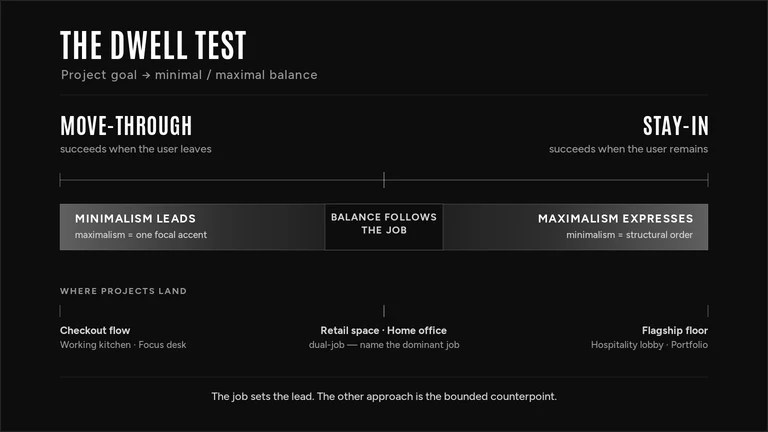
The job sets the lead. When the goal is to move people through, minimalism anchors the structure and maximalism is confined to a single focal point that does not block the path. When the goal is to keep people in, the expressive density runs, and minimalism becomes the structure that keeps that density legible instead of chaotic. The approach that serves the user’s actual task governs; the other one is allowed in only as the bounded counterpoint.
Few projects are purely one job. A retail space wants you to linger and to find the register. A home office wants focus and wants to feel like yours. When a project carries both, name the dominant job — the one that defines whether the project worked — and let it set the lead. The secondary job earns the accent, not the structure. A focus-first workspace can hold one expressive wall. It cannot be built on ten.
This is the discipline that separates a decision from a preference. You are not asking which style you like. You are asking what the user came to do, and answering to that.
Key takeaway: Decide the minimal/maximal balance before you style anything. Run the Dwell Test first — does the project succeed when the user moves through it or stays in it — and let that answer choose which approach leads and which one accents.
How Do You Blend Maximalism and Minimalism in Practice?
The most effective technique for blending these design philosophies is to anchor the space with one dominant approach and introduce the other as a deliberate counterpoint.
Work the section as five sequenced decisions. Each one names the move, the method, and the concrete rule or tool that tells you whether you got it right.
| Step | The decision | Method, ratio, or tool |
|---|---|---|
| 1 | Set the structural envelope | Lock a 60-30-10 split before buying anything: 60% dominant neutral, 30% secondary, 10% accent. Build and test the palette in Coolors or Adobe Color, and assign the 60% to walls, floors, and large furniture. |
| 2 | Assign one focal point | Choose a single statement piece and size it to roughly two-thirds the width of the wall or furniture it anchors. One large gesture does the work of ten small ones; everything else defers to it. |
| 3 | Set the accent logic | Tie every bold element to one rule—a single color temperature (all warm or all cool) or a complementary pair. If an accent does not fit the rule, it stays out. This is what separates richness from noise. |
| 4 | Layer density at the detail level | Add maximalist complexity only through movable items—textiles, ceramics, books, plants—on open shelving, where each object has to earn its slot by visual contribution. Step back at every stage; density builds faster than it feels. |
| 5 | Protect the breathing room | Keep 30–36 inches of clear walkway and leave at least one surface empty. That negative space is what lets the focal point read as intentional rather than excessive. |
These five decisions translate directly to brand systems. The structural foundation comes first: a core message and visual identity, the dominant signal everything else defers to. Then the signature expression, one conceptual move that makes the brand recognizable. The third decision is the one most brands skip: establishing the logic that governs which signals belong and which do not. Not taste, but discernment measured against a system. From there, the expressive complexity fills in. Content, campaigns, social presence, each piece earning its position by reinforcing the same meaning. The last decision is about negative space: the discipline to say less so that what you do say carries weight. We lean toward restraint for exactly this reason. Fewer signals with coherent meaning outperform more signals with diluted meaning, in a room or in a brand.
Key takeaway: The structural rule is one dominant approach as the foundation, one as the accent. Reversing this—trying to build maximalist structure with minimalist accents—tends to produce visual confusion.
What Are the Most Common Mistakes When Mixing Design Styles?
The most frequent failure in style blending is the absence of a unifying principle. Without one, adding maximalist elements to a space does not enrich it—it complicates it.
No anchor element. When every surface and object competes for attention with equal intensity, the eye has nowhere to rest. A space needs at least one area of visual relief, even if the overall register is maximalist.
Mismatched scales. Combining many small bold elements without any large-scale maximalist statement tends to feel busy rather than rich. A single oversized piece does more work than ten smaller ones.
Color without logic. Maximalist color use works when it follows a coherent logic—complementary tones, a consistent temperature, or a deliberate palette that ties disparate elements together. Arbitrary color combinations produce visual noise.
Over-editing the maximalist elements. Some designers apply minimalist restraint so thoroughly that the maximalist accents lose their force. If you are going to use a bold element, commit to it. Tentative maximalism reads as indecision.
Key takeaway: Mixing styles requires a decision about hierarchy. One approach governs the structure; the other operates within it.
The same failure modes show up in branding. A brand with no anchor element is saying too many things at equal weight, with no core message that everything else defers to. Mismatched scales looks like investing in scattered small gestures, social posts and one-off campaigns, without the large-scale commitment of a coherent brand narrative that would make those gestures cumulative. Tone inconsistency is the brand equivalent of color without logic: warm in one channel, clinical in another, no governing system connecting them. And over-editing the expressive elements is the brand that holds a strong perspective but hedges it into blandness because being bold feels risky. The pattern we see consistently is that the fix is almost never to add more. Decide what leads, remove what competes, let the remaining signals do their work.
How Do You Start a Minimalist-Maximalist Hybrid Design Project?
- Define the function first. Before addressing aesthetics, clarify what the space needs to do. Function informs structure, and structure informs how much expressive complexity the space can hold.
- Establish the minimalist envelope. Choose your structural palette—wall colors, floor materials, primary furniture forms. Keep this layer neutral and coherent. It does not need to be plain, but it should be unified.
- Identify one primary focal point. Decide where the expressive weight of the space will concentrate. This is your maximalist statement. Everything else supports or defers to it.
- Layer in secondary elements. Add textiles, objects, and accessories incrementally. Step back at each stage. Visual density builds faster than it feels in real time.
- Edit against the principle. Remove anything that competes with the focal point without contributing to it. The test: does this element make the space more coherent or less?
For brand projects the sequence is the same but the materials change. Defining the function means naming the brand’s actual job: what it needs people to understand, feel, and do. The minimalist envelope is the structural foundation you lock first. Core narrative, visual system, strategic filters that govern every decision. From there you choose one focal point, the conceptual position that makes the brand recognizable, and build everything else to support it. Content, campaigns, touchpoints all come next, each one measured against the structure. The last step is the hardest. Removing signals that feel good but do not cohere, because coherence is what compounds into trust over time.
Key takeaway: The process is iterative. Begin with less than you think you need. Adding is easier than editing once a space is assembled.
What This Looks Like in Brand Work
This is where the design question stops being about rooms. At Subverse we build brand systems, and the discipline is the same: every element a brand puts into the world—its language, its design, its tone, the things it chooses to leave out—is a signal, and each one either reinforces the same meaning or competes with it. A brand that says everything at once says nothing clearly. That’s maximalism with no structure to hold it.
The reflex in branding is to treat the fix as addition: more content, more channels, more output. But coherence is a matter of whether the signals agree, not how much you produce. The minimalist move, removing what does not carry meaning, is what gives the expressive elements room to register. We lean toward restraint for the same reason a well-composed room does: fewer signals with coherent meaning beat more signals with diluted meaning.
This shows up almost every time a brand comes to us feeling cluttered. The pattern we see consistently is the same: the brand is saying too many things at equal weight, in too many registers, across too many channels. It is rarely missing anything. In a recent client project the homepage, the pitch deck, and the social presence each told a slightly different story, and the instinct in the room was to write one more line that would tie them together. The work was the opposite. We removed the competing signals one at a time until a single message could register, then decided where the brand was allowed to be expressive on top of it. It is the same move as clearing a surface so the focal point reads as intentional rather than excessive.
So the decision that governs a hybrid space is the decision that governs a brand system: which approach leads, and what everything else defers to. Make that call against the structure, not against preference. In a room, the test is whether an object earns its position. In a brand, it is whether a signal coheres. Same discipline, different material.
Conclusion
Minimalism and maximalism are not aesthetic choices in opposition. They are organizational strategies that work better together than apart. One provides the structure that makes the other legible. One provides the expression that makes the other livable.
The discipline is in the decision about which one leads. Make that decision first. Then build within it.