
Color is not decoration. Every color choice a brand makes sends a signal—about its values, its audience, its position in a market. Conventional color combinations signal safety, familiarity, and predictability. Unconventional color combinations signal something else: distinction.
This article explains what makes a color combination unconventional, why rule-breaking works in brand design, and how to make bold color decisions that hold together as a coherent visual system.
What You’ll Learn
- Why color functions as a signal system, not just an aesthetic choice
- What distinguishes unconventional color combinations from simply poor ones
- How leading brands have used unexpected palettes to build recognizable identity
- The practical method for choosing unconventional colors that maintain visual coherence
- When breaking color rules strengthens a brand and when it undermines one
What Makes a Color Combination “Unconventional” in Visual Design?
An unconventional color combination departs from established color theory guidelines—complementary pairings, analogous groupings, the 60-30-10 ratio—in a way that produces a distinctive and intentional visual effect. The difference between unconventional and simply wrong is purpose. Unconventional combinations are chosen, not defaulted to.
Traditional color theory provides the framework most designers learn first. The color wheel maps primary, secondary, and tertiary colors, and the relationships between them—complementary (opposite), analogous (adjacent), triadic (equidistant)—define the standard vocabulary of harmonious color use. The 60-30-10 rule structures this further, recommending 60% dominant color, 30% secondary, and 10% accent to maintain visual balance.
Unconventional combinations break these rules deliberately. Teal paired with burnt orange. Chartreuse against deep violet. Electric blue alongside warm terracotta. These combinations create tension that conventional pairings avoid, and that tension is the point. Used well, it creates visual energy. Used poorly, it creates noise.
Definition:
| Element | Content |
|---|---|
| Term | Unconventional color combination |
| Plain definition | A color pairing that intentionally violates standard color theory guidelines to produce a distinctive visual effect |
| Why it matters | In saturated visual environments, conventional palettes recede into the background; unconventional palettes differentiate |
| Common confusion | Often mistaken for careless color use; the distinction is whether the departure from convention is intentional and serves the brand’s meaning |
Key takeaways:
- Unconventional color combinations are defined by intent, not just outcome
- The violation of color theory rules must serve a purpose to be effective
Why Do Unconventional Color Combinations Work for Brand Differentiation?
Unconventional color combinations work for brand differentiation because distinctiveness is itself a signal. When a brand’s visual palette stands apart from competitors, audiences remember it more readily and associate it more specifically with that brand’s identity.
Most markets converge on similar color palettes over time. Tech companies default to blue and white. Health brands default to green and soft neutrals. Finance defaults to dark blue and gold. This convergence happens for good reasons—these colors carry meanings that audiences associate with the relevant values—but convergence also creates sameness. When every brand in a category looks alike, color stops doing any work as a differentiator.
Breaking the pattern is itself communication. Spotify’s use of vibrant green paired with black—unexpected in a media landscape dominated by reds and blues—signals energy and freshness. Google’s multi-color logo, which violates the convention of brand color unity, signals playfulness and breadth. Gucci’s combinations of rich purple with bright yellow or deep green with bold pink signal avant-garde luxury without announcing it directly. The color choice does the work.
The mechanism is what psychologists call the von Restorff effect, named for Hedwig von Restorff, who documented it in a 1933 study published in Psychologische Forschung: an item that stands out against an otherwise uniform set is encoded in memory more reliably than the items it sits among. Unconventional color combinations trigger this effect at the visual level, making a brand more likely to be noticed, remembered, and retrieved when audiences encounter relevant situations.
Key takeaway: When an entire industry converges on safe color conventions, breaking those conventions becomes the most direct way to create visual distinctiveness that audiences actually retain.
What Is the Role of Color Psychology in Unconventional Palettes?
Color psychology describes the associations between specific colors and emotional or behavioral responses. Those associations carry real weight in how audiences read a brand: writing in Management Decision, the marketing researcher Satyendra Singh found that color drives somewhere between 62 and 90 percent of a person’s first assessment of a product. Understanding these associations allows designers to build unconventional palettes that feel surprising but not arbitrary—the unexpected pairing creates a specific emotional effect rather than confusion.
Colors carry consistent psychological meanings across most Western contexts. Red signals urgency, energy, and appetite. Blue signals calm, trust, and authority. Yellow signals optimism and attention. Green signals nature, health, and permission. These associations do not disappear when colors are used unconventionally. They interact.
Pairing red with deep teal, for example, combines urgency with depth. The contrast is unexpected, but both colors are individually strong and their pairing creates a specific kind of tension—energized but grounded. This is different from pairing red with orange, which compounds similar associations and produces warmth but not contrast.
The practical method: when building an unconventional palette, identify the psychological meaning of each color independently, then evaluate what happens when they interact. The goal is not to cancel meanings out but to produce a compound effect that serves the brand. A financial services brand that wants to signal both authority and approachability might pair deep navy with a warm amber—the navy delivers the authority signal, the amber disrupts the coldness that typically accompanies it.
Key takeaway: Unconventional color psychology is additive, not subtractive. The goal is to combine colors whose individual meanings interact productively, not to find pairings that neutralize each other.
How Do You Choose Unconventional Colors That Maintain Visual Coherence?
Visual coherence in an unconventional palette depends on shared structure, not shared hue. Colors can differ dramatically in their positions on the color wheel while remaining coherent through consistent value, saturation, or temperature relationships.
The most reliable method for building a coherent unconventional palette involves fixing one or two visual variables while varying others. Choosing colors that share the same saturation level—vivid against vivid, muted against muted—creates coherence even when the hues are unexpected combinations. Similarly, pairing colors at similar lightness values, or consistently mixing warm and cool tones across the palette, creates a structural logic that audiences register without necessarily articulating.
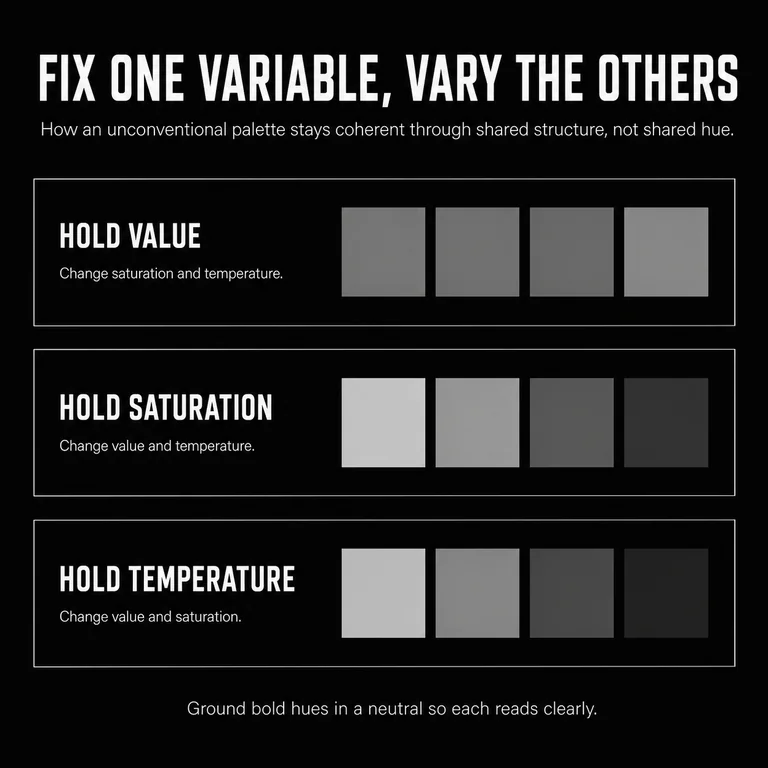
Grounding the palette in a neutral—white, black, warm gray, or deep charcoal—provides stability for bolder hues. The neutral does not compete with the unconventional colors; it gives them room to operate. This is not a limitation on boldness but a compositional choice that makes the boldness legible.
A practical framework for unconventional palette development:
- Identify the emotional territory the brand occupies and the emotional effect the palette should create
- Select a primary color that anchors this territory
- Choose a secondary color that introduces tension or complexity rather than harmony
- Ground both in a neutral that allows each to read clearly
- Test the combination in context—at scale, at small sizes, on the backgrounds where it will actually appear
- Evaluate coherence by asking whether the palette reads as intentional at first glance
Key takeaway: Coherence in an unconventional palette comes from structural consistency in value, saturation, or temperature—not from choosing colors that naturally harmonize.
How Have Successful Brands Used Unconventional Color to Build Identity?
Several brands have made unconventional color choices the center of their visual identity, using unexpected palettes to communicate specific and differentiated meaning.
Spotify’s signature green (#1DB954)—a vivid, almost electric mid-green—was unconventional at launch in a digital media landscape dominated by warmer tones and dark backgrounds. Against black, it signals energy without aggression. The color has become so associated with Spotify that it functions as a proprietary signal: audiences recognize the brand before they read the name.
Google’s multi-color wordmark violates the conventional principle that logos should use a single color or a closely coordinated palette. Each letter cycles through primary and secondary colors with no apparent system. The effect—playfulness, openness, lack of hierarchy—communicates exactly what Google’s brand position requires. The “wrong” choice was the right one for the specific meaning.
Gucci under Alessandro Michele (2015–2022) pushed the brand’s color language toward unexpected combinations: greens with reds, purples with oranges, blues with pinks. These combinations referenced historical sources—Renaissance painting, 1970s maximalism—while remaining distinctly contemporary. The palette communicated luxury through reference and confidence, not through convention.
In each case, the unconventional color choice was not decorative but strategic. The palette communicated something specific about the brand’s identity that conventional palettes could not have delivered.
Key takeaway: Successful unconventional color use is always in service of a specific brand meaning. The palette differentiates because it communicates, not just because it surprises.
What Does an Unconventional Color Decision Look Like in Practice?
We made an unconventional color decision on our own brand. We removed color entirely. Subverse runs an achromatic system: a near-black ground, white, and a graded ramp of grays, with no accent hue anywhere. In a field that signals value through more color, more motion, more ornament, the absence is the signal. Contrast does the work an accent hue would do elsewhere.
The convention we broke is the expectation that a brand needs a color to be its color, the one swatch that owns the logo, the buttons, the chart. For a studio whose whole argument is restraint and coherence, an accent hue would contradict the message. The palette had to demonstrate the discipline we sell, so we set the constraint and held it. Every decision about what belongs answers to the system, not to whether a color looks good on its own.
The same rule travels into client work, and it follows from how we practice Narrative Branding: a brand is a system of signals, and every signal has to reinforce the same meaning or it weakens the whole. Color is a signal like any other. So before reaching for an unexpected combination, we ask one question: is the current color doing semantic work, or is it only making the brand look like its category? When every competitor has converged on the same two or three colors, the conventional palette has stopped carrying meaning and started carrying membership. That is when an unconventional combination earns its place, because it gives the brand a signal that belongs to it. When the convention still does real work, the safety a healthcare green signals or the authority of a legal navy, we keep it. What settles the decision is coherence: a color earns its place when it still says something specific about the brand, conventional or not.
When Should a Brand Break Color Rules?
A brand should consider breaking color rules when the conventional palette in its category has become so uniform that all competitors look alike, when the brand’s identity requires signals that conventional colors cannot carry, or when distinctiveness is strategically more valuable than familiarity.
Breaking color rules is not always the right decision. In categories where color conventions carry strong meaning that the brand needs—healthcare, where green and white signal cleanliness and safety; legal services, where dark navy signals authority—departing from convention can undermine the primary signals the brand needs to send.
The decision rule: if conventional color does necessary semantic work the brand cannot afford to sacrifice, maintain it. If conventional color is doing nothing but making the brand look like its competitors, unconventional color is worth exploring.
The strongest case for breaking rules is when a brand’s audience has become fluent in the category’s color language and reads conventional palettes as generic. Audiences that have seen enough competitors in the same color family learn to ignore it. Distinctiveness at that point requires a deliberate departure.
If X, then Y: If every major competitor in a category uses the same two or three colors, then an unconventional palette will register as differentiating before the audience reads a single word.
Common mistake: Breaking color rules for novelty alone, without connecting the new palette to a coherent brand meaning. Unconventional colors that feel random—rather than intentional—communicate lack of judgment, not boldness.
Key takeaways:
- Break color rules when convention has collapsed into sameness in your category
- Maintain conventional color when it carries specific semantic meaning the brand requires
- Connect every unconventional choice to what the brand needs to communicate
Conclusion
Color does more than make things look good. It signals meaning, builds recognition, and differentiates brands in visual environments where most signals compete for the same attention.
Unconventional color combinations are not a trend. They are a tool—one that becomes more valuable as categories mature and conventional palettes become indistinguishable from each other. Used with purpose and structural coherence, an unexpected palette can do what well-crafted copy cannot: register meaning before the audience decides to read.
The question for any brand considering unconventional color is not “Is this safe?” Convention is what made the market look the same. The question is whether the palette communicates the right thing, holds together as a system, and gives the brand a signal that belongs to it.