
People have gotten good at spotting performed sincerity. Two decades of interfaces engineered to feel effortless taught them what the effort looks like, and polish that used to read as competence now mostly reads as budget. Rawness is what still reads as honest. That is the claim Brutalism makes — a page that shows its own construction, heavy type and exposed grid and contrast that refuses to go soft, looks like it is not managing anything on your behalf.
Brutalism in visual design is a deliberate aesthetic philosophy — not an accident, and not an absence of taste. It draws from mid-20th century architectural Brutalism, which exposed raw concrete and structural honesty over ornamentation, and translates those principles into typography, layout, color, and digital interfaces. Where mainstream design trends favor smoothed edges and invisible infrastructure, Brutalist design puts the infrastructure on display.
What You’ll Learn
- Where Brutalist design comes from and what distinguishes it from other visual styles
- Why audiences respond to it now, and why that response is more than aesthetic preference
- What the core principles look like in practice
- How to implement Brutalism without undermining usability
- What designers most often get wrong about the movement
What Is Brutalism in Visual Design?
Brutalist visual design is an approach that exposes structure, rejects decorative polish, and treats rawness as a design choice rather than a deficiency. The style emerged in digital and graphic design during the 2010s as a deliberate counter to the prevailing aesthetic of minimalist, sanitized interfaces — and it draws its philosophical grounding from a much older movement.
Architectural Brutalism originated in post-war Europe. The term derives from the French “béton brut,” meaning raw concrete — a phrase Le Corbusier used to describe exposed material as both method and statement. Alison and Peter Smithson turned that idea into a label in 1953, and the critic Reyner Banham carried it into English print in December 1955 in the Architectural Review — an essay he spent the next eleven years widening into The New Brutalism (1966). Banham’s test is worth keeping, because it is not about concrete: a building qualified by being memorable as an image, by exhibiting its structure plainly, and by valuing its materials as found. Brutalist architects like Le Corbusier and Louis Kahn built structures that refused to hide how they were made. The concrete was visible. The structural elements were the aesthetic. Ornamentation was treated as dishonesty.
In visual and digital design, those instincts produce something different in form but consistent in logic. Brutalist design doesn’t hide that a website is made of text and boxes. It makes that fact central. Bold typography sits heavy on the page. Layouts reject the invisible grid. Color contrasts create friction. The seams are visible, and the visibility is the point.
| Element | Content |
|---|---|
| Term | Brutalism (visual design) |
| Plain definition | An aesthetic approach that exposes structure, rejects decorative polish, and treats rawness as deliberate choice |
| Why it matters | Signals authenticity and differentiation in a design landscape defined by sameness |
| Common confusion | Often mistaken for poor design or lack of refinement; it is intentional, not unfinished |
Key takeaway: Brutalism in visual design is not the absence of intention. It’s the presence of a different one.
Why Is Brutalism Making a Comeback?
Brutalist design is gaining traction because it signals something minimalist interfaces cannot — honesty about how something is built. The signal works by contrast: in an environment where concealment is the default, a design that declines to conceal is legible without having to explain itself.
There’s a countercultural dimension too. Minimalism has become the default visual language of venture-backed products, polished marketing, and aspirational brands — so dominant that some designers now temper it with maximalist energy in a deliberate blend of restraint and expression. It’s the aesthetic of things that want to seem inevitable. Brutalism disrupts that register. When everything else is smooth, deliberate roughness is a statement.
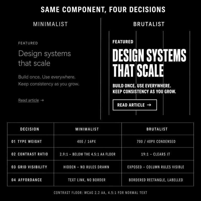
But the revival isn’t only reaction. Brutalist aesthetics are durable because they solve real problems. Bold, legible typography is accessible. High-contrast color schemes work across devices and lighting conditions — and the field they arrive into is failing at exactly that. WebAIM’s 2026 audit of the top million home pages found text below the WCAG AA contrast minimum on 83.9 percent of them, up from 79.1 percent the year before, at an average of 34 separate instances per page. It is the most common accessibility failure on the web. A palette that refuses to go soft clears a bar most polished sites miss. Unconventional layouts can create genuine hierarchy when conventional grid structures have become invisible to users who scan past them without reading.
Key takeaway: Brutalism resonates not because audiences miss ugliness, but because they respond to design that doesn’t try to flatter them with seamlessness.
What Are the Core Principles of Brutalist Design?
Brutalist visual design is built on four principles, each translating the architectural movement’s values into visual terms.
Structural honesty. The design doesn’t conceal its own construction. Navigation is visible as navigation. Content areas are legible as content areas. There’s no effort to make the scaffolding disappear.
Functional primacy. Every element exists because it serves a purpose. Decoration that doesn’t contribute to meaning or usability is removed or questioned. This doesn’t mean austere — it means intentional.
Visual weight. Brutalist design uses scale, contrast, and density deliberately. Typography is often heavy. Color is often stark. These choices create hierarchy without pretense.
Rejection of polish as default. Smooth gradients, rounded corners, and soft shadows aren’t bad choices — they’re just choices. Brutalism treats them as one option among many, rather than the obvious, tasteful response.
These principles don’t produce a single look. Brutalism ranges from the stark black-and-white typography of certain editorial sites to the garish high-contrast of underground art projects. What they share is refusal to defer to the conventions of refined, frictionless design.
Key takeaway: Brutalism is not a visual template. It’s a set of values about what design should expose rather than hide.
How Does Brutalist Design Work in Practice?
Brutalist design in practice means making different choices about typography, layout, color, and hierarchy — and being willing to tolerate tension in the result.
Typography. Brutalist design typically uses heavy, legible typefaces at large sizes. The type doesn’t blend into the background. It occupies space with intention. Fonts are chosen for their visual presence, not their invisibility.
Layout. Grid structures become visible rather than invisible. Asymmetry creates tension. Content is placed where it serves the meaning, not where the template expects it. Some Brutalist designs break from the grid entirely.
Color. High contrast is characteristic. This may mean black and white with a single accent, or competing colors that create visual friction. The palette is never soft.
Interaction. On the web, Brutalism often means interfaces that don’t try to disappear. Buttons look like buttons. Links look like links. The cursor behaves predictably because the interface doesn’t pretend to be something other than an interface.
Sites like The Drudge Report, Craigslist, and Hacker News are frequently cited as accidental Brutalism — they were never designed to be raw, and that indifference became its own aesthetic. Deliberate Brutalism makes conscious choices that arrive at a similar place for different reasons. The difference between accident and intention is everything.
Key takeaway: Successful Brutalist design is not undesigned. It’s designed with different intentions about what the finished work should reveal.
Does Brutalism Sacrifice Usability?
Brutalism does not inherently compromise usability. Undisciplined application of Brutalist aesthetics can — but that’s a problem of execution, not philosophy. Kate Moran drew the same line for Nielsen Norman Group in Brutalism and Antidesign, holding brutalism, which inherits an architectural argument about exposed structure, apart from antidesign, which discards hierarchy as the point rather than as a side effect. Her warning falls on the second: outside a narrow band of designer and entertainment audiences, an antidesign interface backfires. That is the objection most often aimed at work like this, and the distinction is what answers it — a defense of one is not a defense of the other.
The distinction matters. Brutalism’s visual weight — heavy type, high contrast, visible structure — can improve accessibility and legibility when applied with care. A well-constructed Brutalist site can be easier to read than a minimalist one where contrast is sacrificed for visual calm. Three things have to hold. Nav items and buttons clear 24 by 24 CSS pixels, the pointer-target floor WCAG 2.2 sets. Heading levels descend without skipping, so the document outline survives a layout that has stopped behaving. And whatever the visual arrangement, the DOM order still has to match the reading order — that is the first thing absolute positioning breaks when a grid gets broken on purpose. Brutalism addresses these requirements through different means; it doesn’t dissolve them.
The failure mode is designing for provocation rather than communication. Brutalism that prioritizes shock over function produces interfaces that feel hostile. The strongest examples of the style make structural choices that are demanding but not obstructive, and the boundary between the two is measurable. Body text holds 4.5:1 against its background, display type 3:1 — the same AA floors every other site is held to, and ones a stark palette usually clears by a wide margin. Borders, icons, and focus rings hold 3:1 as well. A button that reads as a button because of its border stops reading as one the moment that border goes decorative grey. Tap targets stay at 24 pixels, and at 44 where the action is destructive or hard to undo. Past those numbers, the layout can be as strange as the argument requires.
At Subverse the request arrives in a recognizable shape: a brand wants the raw look, because the raw look reads as honest. The reasoning is usually sound on its face. The category is crowded, everything in it is smooth, and roughness would separate the brand from the rest.
The question we ask back is whether anything underneath the design is actually exposed. Architectural Brutalism declined to cover the structure it already had; the look was a consequence. A brand that adopts the aesthetic while keeping its operations, its pricing, and its language as managed as everyone else’s has exposed nothing. It has added one more surface. Audiences read the distance between how a brand looks and how it behaves well before they can explain it, and the roughness does the opposite of the job it was hired for.
So the decision turns on one test, and it isn’t a visual one: does this choice agree with what the organization is doing? Where it does, we build it, and the aesthetic holds up under contact because there is something behind it. Where it doesn’t, we say so. The problem usually wasn’t visual.
Authenticity moves through this field on a cycle. The vocabulary refreshes every time it returns. Brutalism is the current dress for a question no aesthetic answers on its own: why does this brand deserve to exist?
When to use Brutalism: When the design needs to signal honesty, rawness, or resistance to mainstream conventions — and when your audience reads that signal as relevant. A hospital’s patient portal is not a candidate for asymmetrical layouts and stark typography. A music label’s site might be.
Key takeaway: Brutalism can be highly functional, and the discipline it takes fits in an afternoon. Give five to eight people from the actual audience one real task — find the pricing, book the appointment. Record where they click first, before they start exploring. Bob Bailey and Cari Wolfson’s first-click research — a dozen studies run between 2006 and 2009 — found that people who get that first click right finish the task 87 percent of the time, against 46 percent when they get it wrong. Below roughly 80 percent first-click accuracy, the layout is the problem, not the taste of the people using it.
Conclusion
Brutalism in visual design is not a rejection of craft. It’s a different idea about what craftsmanship should reveal. Where minimalism argues for invisible infrastructure and seamless experience, Brutalism argues for honesty about structure — and for letting that honesty do visual work.
The movement’s architectural origins gave it its philosophical foundation: raw materials, exposed structure, form that declares how it was made. Visual design translated those principles into typography, layout, and interface. The result is an aesthetic that reads as authentic precisely because it refuses to perform refinement.
If Brutalism fits your context, it demands real discipline. Intentional rawness and messy execution look alike in a screenshot and come apart under three questions. Can you name what each rough choice exposes — a constraint, a process, a structure that is actually there — or is it rough because rough is the look? Does the roughness clear the contrast and target floors above without an exception carved for it? Would you make the same choice if the aesthetic were unfashionable? A design that answers all three is exposed; one that answers none is decorated to look it. And the audience has to be one that reads deliberate roughness as a signal worth trusting.