Art Nouveau didn’t fade because it failed. It faded because it was expensive, time-consuming, and built on a premise that industrialization was actively dismantling: that every object made deserves to be beautiful.
That premise is back. And understanding why it keeps returning tells you something important about how visual design actually works—and what audiences are responding to right now.
What You’ll Learn
- What Art Nouveau is and why it emerged when it did
- What defines the movement’s visual language and why those choices were deliberate
- Where Art Nouveau’s influence appears in contemporary design practice
- Why the movement resonates emotionally in a digital-first environment
- How to incorporate Art Nouveau principles without pastiche
What Is Art Nouveau?
Art Nouveau is a design movement that emerged in Europe between roughly 1890 and 1910, characterized by flowing organic lines, nature-derived motifs, and the deliberate integration of fine art and applied craft. The movement rejected the decorative conventions of historicism and the functional austerity of industrialization in favor of a new visual language rooted in natural form.
Art Nouveau was practiced across Europe under different names—Jugendstil in Germany, Stile Liberty in Italy, Modernisme in Catalonia—but shared a commitment to line as a primary expressive tool. Figures like Alphonse Mucha, Hector Guimard, Victor Horta, and Antoni Gaudí each pushed the movement in different directions, but all worked from the same premise: that beauty is not decoration added to function. Beauty is function, expressed at a different register.
Key takeaway: Art Nouveau wasn’t escapism. It was a design argument—one that claimed organic form is more humane than mechanical repetition, and that argument is worth taking seriously.
Why Did Art Nouveau Emerge When It Did?
Art Nouveau emerged as a direct response to industrialization’s visual consequences. In the late 19th century, mass production had made objects abundant and cheap, but it had also made them visually indistinct. The Arts and Crafts movement, led by figures like William Morris, pushed back first—arguing for handcraft and individual artistry. Art Nouveau absorbed that argument and extended it, applying organic formal principles not just to craft objects but to buildings, posters, ironwork, and glass. The design historian Nikolaus Pevsner built his account of modern design around this exact line of descent: Pioneers of Modern Design: From William Morris to Walter Gropius (1936) reads Art Nouveau as the hinge between Morris’s revolt against the machine and the modernism that came after, the point where the case for the handmade hardened into a new visual language.
The deeper driver was a loss of meaning in the designed environment. When everything is mechanically reproduced, nothing carries a maker’s intention. Art Nouveau was an attempt to restore intentionality to visual culture—to make every designed surface a statement about the relationship between form, material, and human experience.
That tension—between mechanical efficiency and expressive craft—is not historical. It remains structurally present in every design decision about speed versus care, template versus original, system versus exception.
Key takeaway: Art Nouveau arose because the designed environment had lost coherence and meaning. That diagnosis recurs in every era. The specific solution shifts; the underlying condition doesn’t.
What Are the Defining Visual Characteristics of Art Nouveau?
Art Nouveau is defined by five consistent visual principles, each of which carries a philosophical position, not just an aesthetic preference.
Flowing, asymmetric line. The whiplash curve—sinuous, continuous, never rigid—is the movement’s signature mark. It derives from plant growth, not geometric construction. Line in Art Nouveau is alive, directional, and always in motion.
Nature as primary source. Flowers, vines, insects, birds, and water appear not as decorative addition but as structural logic. The Paris Métro entrances designed by Guimard around 1900 use cast iron that moves like plant stems. The material serves the motif; the motif expresses the material.
Synthesis of fine and applied art. Art Nouveau practitioners rejected the hierarchy that placed painting above furniture above typography above architecture. Louis Comfort Tiffany’s leaded glass lamps, Mucha’s posters, Horta’s staircases—each operates at the same level of intentional design.
Material honesty. Iron, glass, ceramic, and tile were used expressively, not disguised. The material’s inherent qualities shaped what the form could be.
Integration across surfaces. In fully realized Art Nouveau interiors, floor, wall, ceiling, furniture, and fittings form a single coherent visual system. Nothing is incidental.
These characteristics explain both the movement’s cost and its ambition. Every element required deliberate decision-making. Mass production couldn’t replicate it because mass production requires consistency; Art Nouveau required variation.
Key takeaway: Art Nouveau’s visual language isn’t a style applied to surfaces. It is a set of structural commitments about how form, material, and meaning relate to each other.
Where Does Art Nouveau Appear in Contemporary Visual Design?
Art Nouveau’s influence in contemporary design is visible across graphic design, fashion, product design, and digital interfaces—most prominently wherever designers are explicitly pushing back against minimalism.
In graphic design, the movement’s organic typography and illustrative complexity appear in brand identities for food, beverage, beauty, and wellness brands that want to signal craft, provenance, and sensory richness. The flowing line and the botanical motif have become reliable shorthand for premium, artisanal, and handmade.
In fashion, designers including Alexander McQueen, Iris Van Herpen, and various couture houses have drawn directly on Art Nouveau’s commitment to garments as sculptural objects—using structure, surface, and silhouette to reference organic form rather than geometric construction.
In digital product design, the counter-reaction to flat design and infinite scroll has produced UI work that borrows Art Nouveau’s decorative density and layered detail. Motion design in particular has found new relevance for the flowing, directional line.
The resurgence is not nostalgia. Designers reach for Art Nouveau’s vocabulary when they need to signal qualities that minimalism can’t carry: complexity, care, materiality, sensory depth. Those signals respond to specific audience needs—and those needs are currently strong.
Key takeaway: Art Nouveau appears in contemporary work wherever the design brief requires signaling craft, richness, or organic vitality that geometric minimalism cannot express.
Why Does Art Nouveau Resonate Emotionally in a Digital Environment?
Art Nouveau resonates because it encodes effort. Every flowing line, every intricate motif, every surface integration required time, skill, and decision-making. Audiences don’t need to consciously recognize this to respond to it. The density of intentional detail signals care.
In a visual environment saturated with algorithmically generated, templated, and rapidly produced content, that signal carries increasing weight. Design that takes time to look at earns attention differently than design that flattens to immediate comprehension.
There is also a sensory dimension. Art Nouveau’s forms derive from living things—from the shapes that organisms develop over time through growth and adaptation. Those forms activate recognition that geometric abstraction does not. Audiences respond to organic curve differently than to straight edge, even in flat digital contexts.
The emotional effect is not sentimentality about the past. It is the recognition that someone made choices here, that the form is not arbitrary, that the surface rewards examination. That experience is increasingly rare and increasingly valued.
Key takeaway: Art Nouveau’s emotional resonance in digital contexts comes from its density of intentional detail—a quality that signals care in environments where care is scarce.
How Do You Apply Art Nouveau Principles Without Producing Pastiche?
The failure mode in Art Nouveau-influenced work is historicism: copying the surface language without understanding the structural logic beneath it. The result is decoration without meaning—motifs that float on a design without being integrated into its logic.
Applying Art Nouveau principles effectively requires engaging with the movement’s structural commitments, not its visual inventory.
Start with line, not ornament. Before adding botanical detail or decorative motif, establish whether the underlying line structure of the design has the fluidity and directionality that Art Nouveau demands. Rigid grids and organic surfaces don’t coexist naturally; the tension requires resolution.
Let the material determine the form. Art Nouveau’s best work emerged when designers allowed material properties to shape what was possible. In digital work, this means understanding what motion, layering, and interaction can do that static layout cannot—and letting those capabilities influence what the form becomes.
Integrate, don’t decorate. The defining quality of high Art Nouveau is that decorative and structural elements are inseparable. When a motif can be removed without changing the design’s function, it is decoration. When removing it would break something, it is integration.
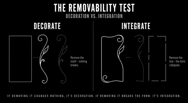
We ran into this distinction directly on a recent identity system. The first round leaned on a decorative motif: a botanical mark that sat on top of the wordmark and repeated across the layouts. It looked the part. But when we tested it the way the movement demands, by asking what would break if we removed it, the answer was nothing. The mark was applied, not integrated. So we cut it and started from the line instead, letting the geometry of the company’s own product shape the single curve that ran through the whole system. The second version carried the same organic quality the motif had been reaching for, except now removing it would have broken the identity. That is the move Guimard makes with the Métro ironwork, translated to a brand system: the form expresses the material instead of dressing it.
Use restraint selectively. Not every surface needs elaboration. Art Nouveau’s most effective applications give the eye a clear path through complexity by establishing hierarchy—areas of density and areas of rest.
Common failure mode: Selecting an Art Nouveau typeface or a botanical illustration and placing it on an otherwise generic layout. The reference is there; the commitment is not.
Key takeaway: Art Nouveau influence works when it is structural, not cosmetic. The question is not which Art Nouveau elements to add but whether the design’s fundamental logic is compatible with the movement’s premises.
What Art Nouveau’s Return Tells Designers
Every time Art Nouveau resurfaces, it’s doing the same work. It’s arguing that the designed environment has become too thin—too fast, too flat, too indifferent to the experience of looking.
That argument has merit in 2025 in the same way it had merit in 1895. The specific conditions are different. The diagnosis holds.
The same diagnosis runs through our work at Subverse, in a different medium. Art Nouveau read incoherence as a problem of the object: surfaces that had stopped meaning anything because nothing tied them together. We read it as a problem of the brand. When an organization’s signals pull in different directions, audiences lose the thread of what it actually is, and no amount of additional output closes the gap. The post’s own principle holds here exactly. Integrate, don’t decorate. A brand becomes coherent the way an Art Nouveau interior does: every element earns its place by agreeing with the whole, not by being added to a surface after the fact. Building that agreement, deliberately and over time, is what we mean by narrative branding.
The designers who apply Art Nouveau’s influence most effectively aren’t reaching for nostalgia. They’re reaching for a visual logic that was built to carry meaning through surfaces—and recognizing that the need for that logic hasn’t gone away.
The movement’s principles reward study not because they’re historical artifacts but because they represent one of the most fully developed answers to a question that every designer eventually faces: what does intentional form actually look like, and how do you make a surface that earns the attention it asks for?