Order is a decision. A lot of brand materials make it by accident: every element arrives at the same volume, the same size, the same weight, the same claim on attention, and the audience is left to work out the sequence on its own. It rarely does. People skim, miss the point, and move on. Visual hierarchy is that same decision made on purpose. It sets the order a brand’s signals arrive in, so the audience reads them the way they were meant to be read.
That ordering is a question of coherence before it’s a question of craft. When a brand arranges its signals the same way every time, audiences learn the pattern, and a learned pattern is a form of trust. The rest of this piece builds on that: what visual hierarchy is, why a predictable order earns trust, how to sequence a brand message so the order holds, and where that order tends to break down.
What You’ll Learn
- What visual hierarchy is, and why it’s really a decision about order
- Why a predictable order is what turns attention into trust
- A method for sequencing a brand message, using the six elements that control attention
- How to keep that order consistent across every brand surface
- Where brand messaging loses its order, and how to recover it
What Is Visual Hierarchy, and Why Is It About Order?
Visual hierarchy is the deliberate arrangement of design elements so that the viewer’s eye encounters information in a specific order: most important first, supporting details second, background last. It organizes perception without requiring instruction. What it really decides is order — the sequence in which a brand’s signals reach the people looking at them.
It works through contrast. Wherever one element differs meaningfully from what surrounds it, in size, weight, color, or placement, the eye registers that difference as priority. The viewer doesn’t choose where to look first; the hierarchy chooses for them. That makes it a sequencing tool, not a styling one. Every design that holds more than one element is already telling the audience what to read first, whether anyone decided it or not.
| Element | Content |
|---|---|
| Term | Visual hierarchy |
| Plain definition | The arrangement of design elements to guide viewer attention in a deliberate sequence |
| What it controls | The order in which a brand’s signals arrive — what the audience reads first, second, and last |
| Common confusion | Treated as an aesthetic principle when it is really a decision about sequence and meaning |
Visual hierarchy exists on every surface a brand occupies: web pages, advertisements, packaging, social posts, presentations. Anywhere multiple elements compete for attention, the hierarchy settles which one wins. The only question is whether the brand sets that order deliberately or leaves it to chance.
Key takeaway: Visual hierarchy is a decision about order. It is the structural mechanism that controls the sequence in which meaning arrives.
Why Does a Predictable Order Build Trust?
A predictable order builds trust because audiences judge a brand before they read a single word. The arrangement of elements signals whether a brand knows what it wants to say, and in what order. Hold that arrangement steady across everything a brand produces and something compounds: audiences develop expectations, learn how to read the brand, and stop having to work to understand it. That learned pattern is a form of trust. It is the structural kind, built from signals that agree with each other over time, not the kind a single message can manufacture.
Order does three things for a brand message:
- It puts meaning first. Every piece of brand communication has one thing that matters most: a headline, an offer, a belief. A clear order lands that central message before anything else competes for it.
- It builds coherence. When the same ordering logic runs across a brand’s materials, the signals reinforce each other instead of contradicting. Coherence is the degree to which a brand’s signals agree, and a consistent hierarchy is one of the clearest ways they agree.
- It lowers the cost of paying attention. Viewers decide quickly whether to engage. A clear order makes understanding cheap, which makes engagement more likely. The friction of having to work out what’s being said is a common reason audiences disengage, and clutter, more than anything, is what produces that friction. Generous space reads as confidence; a crowded surface reads as anxiety.
Jakob Nielsen’s eye-tracking research at the Nielsen Norman Group found that people don’t read web pages line by line. They scan in an F-shaped pattern: across the top, then a shorter pass lower down, then down the left edge. An order that works with that pattern turns casual scanning into genuine attention. An order that fights it gets skipped.
Key takeaway: A predictable order is what turns attention into trust. Brands that order their signals the same way every time become legible, and legibility read over time is what trust is made of.
How Do You Sequence a Brand Message?
Sequencing a brand message starts with one decision and arranges everything else around it. The method holds whether the surface is a homepage, a pitch deck, or a single social post.
- Name the one thing that matters most. Before opening a design tool, write down what the audience must take away from this piece. One thing. If there are several answers, resolve that ambiguity first; it surfaces later as a hierarchy problem.
- Order everything else in relation to it. Give the primary message the most visual weight. Secondary elements get less. Background elements get least. The order isn’t a matter of taste; it follows directly from the decision you just made about what matters most.
- Use the six elements to encode that order. Size, contrast, color, typography, placement, and whitespace are the levers. Each controls a different dimension of attention, and together they turn an abstract ranking into something a first-time viewer can read at a glance.
- Hold the same order across every surface. The specific sizes and treatments change by format; the underlying logic, what ranks first and what ranks second, stays stable. That stability is the coherence audiences learn to trust.
- Run the three-second audit. Step back from the finished piece and look without reading. Can you find the primary message in under three seconds? If not, the order isn’t doing its job yet.
The six levers, and what each one controls:
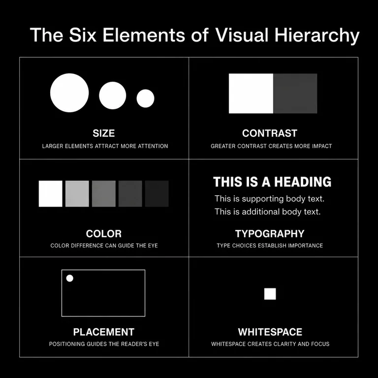
Size and scale are the most immediate. Larger elements register as more important, which is why headlines dominate and body text recedes. But size is about relationship: an element reads as important only against something smaller around it.
Contrast extends beyond size. Light against dark, saturated against muted, dense against sparse — contrast is how hierarchy operates across every other lever. Without it, all elements compete equally and the viewer gets no signal about where to start.
Color directs attention before the viewer has processed a word. In a well-ordered piece it works as a sequencing tool: marking entry points, highlighting actions, separating primary from secondary. The failure is treating color as decoration first and direction second. Color psychology shapes how audiences feel about what they see; hierarchy decides what they see first.
Typography carries the order inside text. Variation in weight, serif against sans-serif, and size creates a structure a reader can navigate without reading every word. People read the typographic signals before they commit to the prose.
Placement follows how people actually scan. Elements at the top-left command more attention, on average, than elements at the bottom-right. Strong placement puts the most important content where attention already goes, which is where the F-pattern points.
Whitespace is the lever most often misread as wasted space. The pressure is always to fill it: to justify the work, to include everything. But whitespace is what lets the other elements speak. It is the difference between a surface that feels composed and one that feels crowded.
What this looks like in our work: We’re often brought in to fix a homepage that opens on the wrong thing. A professional-services firm we worked with led with its founding story: the year it started, its credentials, the markets it had grown into. The one thing a visitor needed, what the firm did and who it was for, sat well down the page at the same visual weight as everything around it. Nothing on the page was wrong. Nothing was first.
The fix was order, not copy. We moved the single outcome the firm delivered to the top, at the largest size and the highest contrast, and dropped the history to a short line near the bottom. In that first pass we changed no words, only the sequence and the weight. After it, a visitor could say what the firm did within a few seconds of landing, without being walked through it. The hierarchy carried the meaning the prose had been straining to deliver.
The same logic held across formats. When we carried that order into the firm’s pitch deck and its social profiles, outcome first and history last, the brand began reading the same way everywhere someone met it. The format changed. The sequence didn’t. That repetition, surface after surface, is where a learned pattern starts to become trust.
Key takeaway: Hierarchy starts with a content decision, not a design decision. Name what matters most, order everything around it, and hold that order steady. The method works because it is repeatable, and repetition is what builds trust.
Where Does Brand Messaging Lose Its Order?
Brand messaging loses its order in a handful of predictable places. Each one is a point where the sequence breaks down and the audience is left, again, to decide what matters on its own.
Equal weight across elements. When headlines, subheads, body text, and calls to action are all similar in size and weight, there is no signal. The fix: widen the gap. Make the primary element clearly larger or higher-contrast than the secondary.
Color used for decoration, not direction. When accent colors appear without a pattern, they lose the power to direct attention. The fix: assign colors a role. If a color marks the primary action, use it only there.
A different order on every platform. A brand’s website might have a clear hierarchy while its social content has none. The visual logic doesn’t carry across, and the learned pattern never forms. The fix: document the ordering system in a brand style guide and apply it everywhere.
Whitespace treated as wasted space. Fill every corner and the order collapses. The fix: build whitespace into templates as a structural element, not whatever is left over.
Typography that contradicts the order. When a subhead is visually heavier than a headline, because it happens to use a bolder face, the visual signal contradicts the content’s intent. The fix: audit typographic weight on its own, and make sure it tracks with actual importance.
Key takeaway: These failures come from decisions that were never made, not decisions made badly. The fix is usually explicit, not complex.
Conclusion
Visual hierarchy controls the order in which meaning arrives. It isn’t decoration. When a brand’s materials guide the viewer to the most important message first, through deliberate size, contrast, color, typography, placement, and whitespace, communication gets more efficient and trust compounds, one coherent surface at a time.
The work that’s missing is rarely skill. It is the underlying decisions: what matters most, and what should follow. Visual hierarchy is where those decisions become visible, and where a brand either reads the same way every time or leaves its audience guessing.
Start with the one thing that matters most. Order everything else around it.