
Most color decisions happen by instinct. A designer picks what feels right, adjusts until something clicks, and moves on. The result often works. But when it doesn’t, diagnosing the problem becomes guesswork.
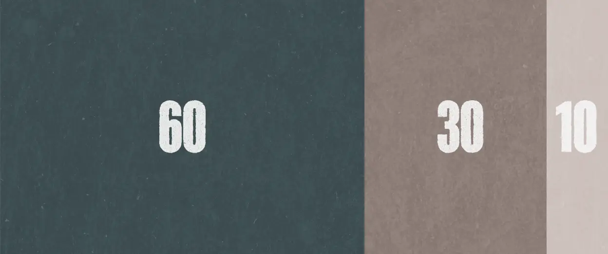
The 60-30-10 rule offers something more reliable. It provides a proportion system for distributing color across a composition: 60% to a dominant color, 30% to a secondary color, and 10% to an accent. The rule builds visual hierarchy through ratio rather than intuition alone.
What Is the 60-30-10 Rule?
The 60-30-10 rule is a proportion guideline for color distribution in visual design. It allocates 60% of the visual space to a dominant color, 30% to a secondary color, and 10% to an accent color. The rule creates hierarchy by giving each color a distinct role based on how much space it occupies.
The dominant color at 60% anchors the composition. It establishes the overall mood and provides visual continuity. The secondary color at 30% supports the dominant without competing for attention. The accent color at 10% creates focal points and draws the eye to specific elements.
Interior designers have used this ratio for decades. It translates well to graphic design, web interfaces, and brand systems because the underlying principle remains constant: balance emerges from intentional proportion.
| Element | Content |
|---|---|
| Term | 60-30-10 Rule |
| Plain definition | A color proportion guideline using 60% dominant, 30% secondary, and 10% accent |
| Why it matters | Creates visual hierarchy through predictable distribution |
| Common confusion | Often treated as rigid law rather than flexible guideline |
Key takeaway: The 60-30-10 rule provides a starting framework for color balance. It reduces guesswork by giving each color a proportional role.
Why Does the 60-30-10 Rule Work?
The rule works because it creates differentiation through contrast while maintaining cohesion through proportion. When colors occupy equal space, they compete. When distribution is random, the composition feels chaotic. The 60-30-10 ratio solves both problems.
The human eye seeks patterns. A composition with clear proportional hierarchy feels ordered even when the viewer cannot articulate why — because proportional distribution manages the cognitive load a design places on attention. The dominant color creates a baseline. The secondary color provides enough variation to sustain interest. The accent color rewards attention by marking what matters most.
This maps to how visual attention operates. People scan compositions quickly, looking for anchor points and contrast. A 10% accent against a 60% background produces enough difference to register without overwhelming. The ratio balances stability with emphasis.
Common failure mode: Designers treat each color as equally important and distribute them evenly. Equal distribution flattens hierarchy and forces the eye to work harder to find focal points.
Key takeaway: The 60-30-10 rule creates differentiation through unequal distribution. Hierarchy emerges because colors serve different functions at different scales.
How Do You Apply the 60-30-10 Rule in Practice?
Application varies by medium, but the core method stays consistent: identify the three roles, assign colors, and check proportions against the framework.
Step 1: Identify the dominant color. This color occupies the most visual space. In a website, the dominant color often appears in the background or primary content areas. In interior design, it covers walls and large furniture. Choose a color that supports extended viewing without fatigue.
Step 2: Select the secondary color. This color provides contrast and visual interest at 30% coverage. It should complement the dominant without matching it exactly. Secondary colors often appear in supporting elements like navigation bars, accent walls, or structural components.
Step 3: Choose the accent color. At 10% coverage, this color creates focal points. Buttons, calls to action, decorative elements, and key highlights use the accent color. High contrast between accent and dominant colors strengthens this effect.
Step 4: Test proportions visually. Step back and assess whether the distribution matches the intended ratio. Tools exist to analyze color coverage in digital files, but trained observation often suffices for rough assessment.
The percentages are guides, not mandates. A composition at 55-35-10 still follows the principle. What matters is maintaining clear hierarchy through unequal distribution.
Key takeaway: Apply the rule by assigning colors to roles first, then checking that proportions create the intended hierarchy.
Where Does the 60-30-10 Rule Apply?
The rule applies wherever color distribution affects perception: graphic design, web interfaces, interior spaces, brand systems, and presentation materials.
Graphic design: Posters, publications, and marketing materials use the rule to guide viewer attention. The dominant color establishes tone while accents highlight headlines or calls to action.
Web and interface design: Digital interfaces benefit from clear color hierarchy. The dominant color typically appears in backgrounds and large content blocks. Secondary colors distinguish sections or navigation. Accent colors mark interactive elements like buttons and links.
Interior design: The rule originated in interior spaces. Walls receive the dominant color, upholstery and curtains the secondary, and decorative objects the accent. The ratio creates rooms that feel balanced rather than overwhelming.
Brand systems: Brand guidelines often specify primary, secondary, and accent colors. The 60-30-10 rule provides a framework for applying those colors across touchpoints with coherence.
Key takeaway: The rule adapts to any context where color distribution matters. The medium changes; the principle of proportional hierarchy remains.
When Should You Break the 60-30-10 Rule?
Break the rule when the design objective conflicts with balanced hierarchy. Some compositions require tension, disruption, or deliberate imbalance.
High-impact designs sometimes invert the ratio, using accent colors at higher percentages to create urgency or visual intensity. Minimalist approaches may use only two colors, eliminating the secondary role entirely. Experimental work often abandons proportion rules to achieve specific effects.
The difference between breaking the rule and ignoring it lies in intention. Designers who understand why the rule works can predict the consequences of deviation. Designers who never learned the rule produce imbalance by accident.
If a composition feels chaotic or flat, return to the 60-30-10 framework and assess whether proportional hierarchy has been lost. The rule functions as both a starting point and a diagnostic tool.
Key takeaway: Break the rule deliberately when the design objective requires it. Use the rule as a diagnostic when compositions feel unbalanced.
Conclusion
The 60-30-10 rule offers a reliable framework for color decisions. It replaces intuition with proportion, giving designers a starting structure that produces visual coherence.
The rule works because it creates hierarchy through unequal distribution. Each color serves a distinct function at a distinct scale. When that balance holds, compositions feel intentional. When it breaks down, the rule provides a diagnostic path back to coherence.
Use the rule as a foundation. Adapt it when context demands. Return to it when something feels wrong. Proportion systems do not replace judgment. They give judgment something stable to push against.