
The physical environment where work happens is not neutral. Before you consciously decide to focus, your brain is already reacting to the room around you—how much sits on each surface, how much empty space remains, how many things compete for your eye. Decades of cognitive research keep pointing to one underlying variable: the load a space places on attention. Get that variable right and focus, mood, and creative output tend to follow. Get it wrong and the environment quietly works against the people inside it.
Minimalism and maximalism usually get framed as opposing tastes. They work better understood as two tools for managing that cognitive load in opposite directions—one to protect attention, the other to provoke it. This article starts with what the research actually shows about environment and the brain, then uses that evidence to decide when each tool belongs.
What You’ll Learn
- The cognitive mechanism that links physical environment to mental performance
- Why task type, not personal taste, should drive the design decision
- When reducing stimulation protects focus, and when adding it fuels creativity
- How to read individual sensitivity and brand meaning into the choice
- How differentiated, zoned spaces support focus and creativity at once
The Real Variable Is Cognitive Load
Working memory runs on a fixed budget. Cognitive load is the total demand placed on it at any moment, and every element in a visual field draws against that budget. The connection between physical environment and cognitive performance has been documented across workplace design, educational research, and clinical psychology—and it keeps coming back to how much the environment asks the brain to process.
Researchers at the Princeton University Neuroscience Institute found that competing visual stimuli reduce the brain’s ability to process information and direct attention. A desk covered in unrelated objects, a wall covered in patterns, a screen ringed with notifications—each creates a low-level cognitive pull that accumulates across a workday. The clutter does not just look busy. It activates competing neural responses that fragment attention.
Barry Schwartz’s research on choice and satisfaction found that fewer unnecessary options correlate with higher wellbeing and lower anxiety. The same logic applies spatially: fewer competing visual inputs create environments that feel effortless rather than exhausting—conditions that support calm, control, and clarity.
More stimulation is not simply worse, though. Research by Ravi Mehta at the University of Illinois found that moderate ambient complexity enhances abstract, associative thinking—the kind of broad connection-making creative work depends on. The same visual richness that fragments analytical focus can widen the search for ideas.
That is the tension in a single line: the load that obstructs focused work is the same load that feeds creative work. What makes an environment good or bad is calibration: whether its load matches the cognitive demands of what actually happens in the space.
Key takeaway: Cognitive load is the variable underneath every design choice. Whether a space helps or hurts depends on matching that load to the work.
Match the Environment to the Work
Because the same stimulation helps one kind of work and hurts another, the design decision starts with cognitive demand. What does this work ask of the people doing it? Answer that first and the choice between minimalist and maximalist settles itself.
Start with function. What work predominantly happens here? Writing, analysis, coding, deep reading—anything that requires sustained focus—calls for reduced visual complexity. Brainstorming, design, collaborative planning, creative production—anything that requires broad association—calls for richness.
| Task Type | Optimal Environment | Rationale |
|---|---|---|
| Deep focus (writing, analysis, coding) | Minimalist | Reduces cognitive load, sustains concentration |
| Ideation, brainstorming | Maximalist | Activates associative thinking |
| Collaborative planning | Moderate stimulation | Supports engagement without fragmenting focus |
| Client-facing or presentation | Matches brand meaning | Creates aligned first impression |
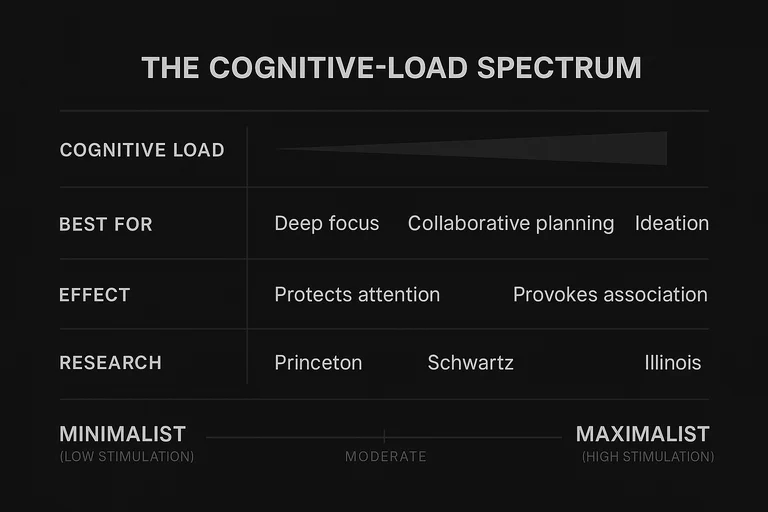
Read this as a map of cognitive demand, not a style chart. The columns describe what the work needs from attention; the environment is whatever delivers it.
Designing for Focus: When Less Stimulation Wins
For concentration-dependent work, the goal is to remove the pull. Minimalist environments reduce cognitive load by limiting the number of stimuli competing for attention. That frees processing capacity for the task, cuts decision fatigue, and lowers baseline stress. For people doing analytical or writing-intensive work, the result is consistent, measurable performance gains.
Common failure mode: Minimalism that removes too much can feel cold, uninviting, or barren. The goal is clarity, not deprivation. A well-executed minimalist space still carries warmth through material quality, natural light, and considered proportion. The difference between restraint and absence is what separates environments that sharpen the mind from ones that simply feel empty.
We see this distinction consistently in the brand environments we build. Organizations that execute minimalism well treat it as a system of clarity — what remains has earned its place, and the negative space is doing work. The failures are almost always the same: someone stripped things away without asking what the remaining elements need to say. The result looks clean but communicates nothing. That gap is never about design skill. It is about whether anyone asked what the space needed to mean before deciding what to remove.
Key takeaway: Minimalist design serves focus-dependent work by clearing cognitive load. The quality of what remains decides whether the result feels clarifying or sterile.
Designing for Creativity: When More Stimulation Helps
For creativity-dependent work, the goal reverses. Here you deliberately raise stimulation to provoke association. Maximalist design fills the environment with layered visual information that supports ideation, brainstorming, and collaboration—at the cost of sustained concentration. The psychological benefits are real, and they are context-dependent.
Exposure to diverse visual inputs—varied patterns, eclectic objects, unexpected color combinations—prompts the brain to make connections across categories, which is a precondition for creative work. Creative studios, advertising agencies, and design firms have understood this intuitively for decades. The vibrant, layered environments they create are not accidental. They are deliberate signals that permission exists to think broadly.
Maximalism also supports personal connection. When a space reflects the identities, interests, and histories of the people who inhabit it, those people feel more attached and invested. That sense of psychological ownership translates into higher motivation and engagement—an effect that matters most in spaces where people spend extended time.
The constraint is concentration. High visual stimulation raises baseline arousal, which supports ideation but interferes with analytical work. People in highly stimulating environments report more difficulty sustaining focus over long periods.
Key takeaway: Maximalist design amplifies creative output and personal connection, but it raises cognitive load. It serves exploration and ideation, not concentrated execution.
Building Differentiated Spaces
Most real spaces host both kinds of work, which is why the strongest environments are differentiated rather than uniformly one style. A hybrid design approach uses one philosophy as the governing system for the overall space and deploys the other deliberately at specific zones to serve different functional needs. The result supports both focus and stimulation without losing coherence.
A minimalist open plan can anchor a workspace while a maximalist collaboration zone—bolder color, layered textures, visual interest—provides a different context for ideation. The contrast, executed with intention, is not confusing. It becomes a signal: stepping into the collaboration zone means entering a different mode of thinking. The reverse works with equal logic—a richly maximalist studio can hold a minimalist library or focus pod where quiet concentration is possible without leaving the environment entirely.
Individual variation matters too. Research on sensory processing suggests that people with higher sensory sensitivity tend to perform better in quieter, less stimulating environments, while people with lower sensory reactivity may need more stimulation to stay engaged. The framework is a starting point, not a substitute for paying attention to how the people in the space actually work.
In client-facing or brand-significant contexts, the environment itself is a signal. A financial advisory firm communicates precision and trustworthiness through minimalist restraint. A creative agency communicates energy and originality through maximalist richness. The design is not only for the people who work there—it tells anyone who enters what kind of organization this is.
In our work with brands, the design failure that recurs is always the same: a space chosen for how it looks rather than what it needs to say. A creative firm defaults to minimalism because it looks polished. A consultancy fills its walls with visual complexity because someone decided the lobby felt cold. Both solve the wrong problem. One sacrifices the stimulation that serves creative output. The other adds noise without asking what the noise means. The shift that changes outcomes is treating the environment as signal: designing around what the work demands and what the brand communicates, not around what feels safe or impressive. We’ve watched teams move from chronic friction about shared spaces to natural flow between focused and collaborative modes, not because a redesign looked better, but because the logic behind it was clear enough that people could feel the intention without being told.
Key takeaway: Differentiated, zoned design works when the logic behind each zone is explicit. Coherence at the system level is what holds the contrast together.
Conclusion
Design shapes performance before intention does. The choices embedded in any workspace—how much visual information competes for attention, how much space exists to think, how much richness or restraint governs the surfaces—set the cognitive conditions in which work happens. That is why the research has to come first: it tells you what the room is doing to the brain before anyone picks a style.
Minimalism and maximalism each serve specific cognitive and emotional needs. Neither is universally correct. The right question is what the people in this space need to do, and how the environment can support it. Which style looks better is the wrong place to start.
A space aligned with its function produces clarity, focus, and belonging. A space misaligned with it creates drag—the kind that compounds quietly and surfaces in output, mood, and the gradual erosion of wellbeing. Getting the design right is not a detail. It is the precondition for everything else.
In our practice, we treat environment the same way we treat any other signal a brand sends. A workspace is one of the loudest — experienced daily rather than encountered once. It communicates whether anyone designed the message or not. The organizations that get this right don’t pick minimalism or maximalism based on which looks better or which study landed in their feed last month. They ask what the space needs to say, design every element to support that answer, and let the rest go.