
Most brands don’t have a design problem. They have a coherence problem.
The logo is right. The colors are approved. The fonts are in the guidelines. And yet something still feels off when you move from the brochure to the website to the Instagram feed. The pieces are technically correct, but the whole doesn’t hold together.
That gap is where brand trust erodes. Audiences feel incoherence before they can name it. They encounter a brand on one surface, then another, and somewhere between those touchpoints, the signal breaks down. The brand stops feeling like one thing.
This article explains what brand coherence across platforms actually requires in print, digital, and social, what causes it to break down, and how to build the structural conditions that keep it intact.
What You’ll Learn
- Why brand coherence is a system problem, not just a formatting problem
- How the constraints of print, digital, and social each demand different design decisions
- What the most common failure modes look like in multiplatform brand design
- How to build brand guidelines that function as working documents, not decorative ones
What Does Brand Design Coherence Actually Mean?
Brand design coherence means that every visual signal a brand produces reinforces the same underlying meaning, regardless of the medium it appears in. Coherence is not sameness. A billboard and a tweet cannot look identical. Coherence means that someone who encounters both still recognizes them as coming from the same source, making the same promise.
The foundation is a shared set of brand elements: logo, color palette, typography, and imagery. But elements alone don’t produce coherence. What produces coherence is the meaning those elements are built to carry, and the discipline to carry it consistently across every context where the brand appears. That meaning comes from strategy rather than the elements themselves, which is the line between brand strategy and brand design.
A color palette used inconsistently tells audiences the brand doesn’t quite know what it is. Color carries an outsized share of that first read: in the 2006 Management Decision paper “Impact of color on marketing,” Satyendra Singh reports that people form a subconscious judgment of a product within 90 seconds of seeing it, and that 62 to 90 percent of that judgment traces to color alone. Of every signal a brand sends, the one doing the most work early is the easiest to let drift across surfaces. Typography that drifts between formal and casual signals that no one is minding the system. Imagery that fits one platform but feels out of place on another suggests that each channel is being treated as its own project, disconnected from the whole.
Key takeaway: Coherence is the alignment between stated meaning and expressed signal. It requires more than design assets. It requires a clear answer to what the brand stands for, and a system for keeping that answer visible everywhere.
How Should Brand Design Differ Across Print, Digital, and Social Media?
Brand design should adapt to the technical and perceptual requirements of each medium while keeping the underlying meaning constant. Print, digital, and social each impose different constraints, and ignoring those constraints produces designs that underperform regardless of how well-crafted the core identity is.
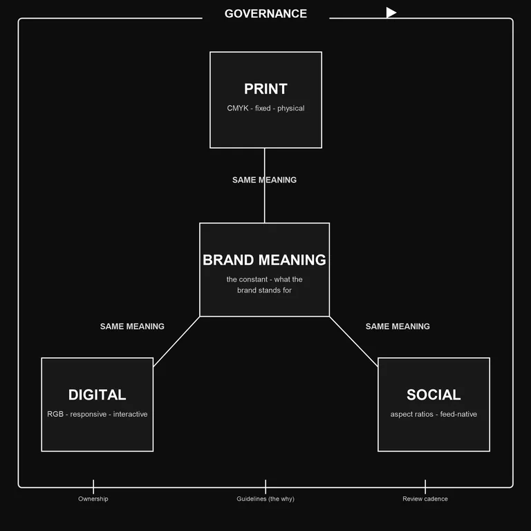
Print demands precision in ways digital does not. Color profiles matter because CMYK rendering differs from RGB display. Paper stock and finish affect how color reads. Tiffany & Co. removed the guesswork by controlling the ink itself. In 2001 it had Pantone standardize its robin’s-egg blue as a proprietary custom color (PMS 1837, named for the brand’s 1837 founding), held outside the public swatch books so no vendor can substitute a near match. The color reads the same on a box, a bag, an ad, and a screen because only one formula for it exists. Few brands need to trademark a Pantone, but the discipline behind it is the point: name the exact color, build the file in CMYK with the profile attached, and a deep navy that looks authoritative on screen won’t come out muddy on press.
Print is also physical and permanent. A brochure stays. A direct mailer sits on a desk. This persistence gives print a different weight than a social post that scrolls past in a second. The design should reflect that: more considered composition, more deliberate use of negative space, less reliance on animation or interactive cues to carry meaning.
The practical requirement: every print application needs a version of the brand assets built in CMYK with color profiles specified. Test prints are essential before any significant run. The brand guidelines should specify what to do, not just what the final output should look like.
Digital
Digital design operates under two competing demands: clarity and speed. Pages load on devices ranging from a 27-inch monitor to a 5-inch phone screen. Images that look crisp at full resolution need to be optimized for fast loading without visible degradation. Layouts that read well on desktop need to reflow legibly on mobile.
Responsive design solves the layout problem, but it doesn’t solve the coherence problem on its own. Responsive design ensures the brand fits each screen. Brand coherence ensures it means the same thing on each screen. The two require different kinds of attention.
For digital, the governing principle is that every user interaction is a brand signal. The button style, the loading state, the error message, the micro-copy — all of it either reinforces or undermines the brand meaning. Most brands build the homepage and forget the rest.
Social Media
Social platforms impose their own constraints: aspect ratios, character limits, algorithmic preferences for certain content formats. Instagram rewards visual density. LinkedIn rewards long-form text with restrained visuals. A brand that posts identically across all platforms will underperform on most of them.
The challenge is adaptation without drift. Each platform-specific adaptation should feel like the same brand making a considered choice, not like a different team running a different account. The test is simple: if you showed someone your Instagram grid, your LinkedIn feed, and your Facebook page without any branding attached, would they read as connected?
Key takeaway: Adapting for each medium is required. Losing coherence in the adaptation is the failure to avoid. The medium shapes the format. The brand governs the meaning.
Here is the same adaptation as a working reference: what stays fixed sits in the left column, and each surface adapts the execution to its own constraints.
| Element | What stays constant | Digital | Social | |
|---|---|---|---|---|
| Color | The exact brand color and what it signals | CMYK build, named/Pantone spec, ICC profile attached, test-printed | sRGB hex, contrast-checked for legibility | sRGB hex, held steady against platform compression |
| Color space | The perceived color | CMYK | RGB (sRGB) | RGB (sRGB) |
| Format & resolution | One asset master | Vector or 300 DPI PDF | SVG / optimized WebP, retina-ready | Platform-spec PNG or JPG |
| Dimensions | Logo proportions and clear space | Fixed trim size with bleed and margins | Fluid, reflows to the viewport | Fixed per platform (1:1, 4:5, 9:16, 16:9) |
| Typography | Typeface and hierarchy | Fixed point sizes and print leading | Responsive type scale, minimum legible size | Legible at thumbnail, heavier weights |
| Composition | Visual hierarchy and tone | Considered, permanent, space-led | Responsive reflow, desktop to mobile | Feed-native, built to stop a scroll |
What Are the Most Common Failures in Multiplatform Brand Design?
The most common failure in multiplatform brand design is treating each channel as a separate project rather than as an expression of a single system. This produces what looks like a design problem but is actually an organizational problem.
When the social team, the print vendor, and the web developer are each working from different versions of the logo, pulling colors from different sources, and making their own calls on typography, the outputs diverge. No individual decision is wrong. The system is just absent.
A pattern we see often: the breakdown stays invisible until you put the surfaces side by side. We worked with a company whose print, website, and social had each been handled by a different person at a different time. On its own, every piece was competent. The printed materials were polished, the site was clean, the social accounts were active. Lined up together, they read as three different companies. The print felt corporate and reserved, the website leaned startup-casual, and the social voice was louder than either. No single choice was wrong. There was just no one holding the through-line.
We didn’t rebuild the identity. Most of the existing assets stayed. What changed was ownership: one person became accountable for whether a new signal agreed with the system before it went out, and the guidelines were rewritten to explain what each element was meant to mean, not just how it should look. Within a couple of cycles, the surfaces started converging again. The design hadn’t changed. The decisions had.
The second most common failure is guidelines that describe outputs rather than decisions. A guidelines document that says “use the primary blue” is less useful than one that explains what the primary blue is meant to communicate and when to use it instead of a secondary palette option. The first gives someone a color code. The second gives someone the judgment to apply it correctly in a context no one anticipated.
The third failure is treating coherence as a one-time problem. Platforms change their specifications. The brand adds new products or enters new markets. Consumer preferences shift. The team turns over. Guidelines built for the brand at one stage in its life stop serving the brand at a later stage, and no one updates them because no one owns the responsibility.
Common failure mode: A brand launches with a strong identity, builds a solid guidelines document, and then watches coherence erode over three years as the guidelines get out of date and each team starts making its own calls. The fix is not a redesign. It is governance.
Key takeaway: Most coherence failures are not design failures. They are governance failures. Someone has to own the system and keep it current.
How Do You Build Brand Guidelines That Actually Hold?
Brand guidelines hold when they are built as decision tools, not reference documents. A guidelines document that sits in a shared drive and gets consulted once a year is not a working system. A guidelines document that makes it easy for anyone on the team to make a correct design call without escalating is.
The difference comes down to three things.
First, explain the why behind every rule. “The logo requires a minimum clear space of 20px on all sides” is a rule. “The clear space exists to ensure the logo reads as distinct and deliberate rather than crowded into a layout” is a rule with a reason. When people understand the reason, they can apply judgment in situations the guidelines didn’t anticipate.
Second, build for the actual users of the document. Brand guidelines are used by designers, but also by vendors, contractors, marketing coordinators, and executives who need to approve something quickly. Build versions of the guidelines appropriate to each audience: a quick-reference one-pager for people who need to make fast decisions, a detailed specification document for production partners, a full rationale document for anyone onboarding to the brand.
Third, assign ownership and schedule reviews. Brand guidelines decay without maintenance. Set a defined review cadence — at minimum annually — to check that specifications reflect current platform requirements, that examples are current, and that any new use cases are addressed. Assign a person or team responsible for that review.
One-sentence rule of thumb: Brand guidelines work when they make the right choice easier than the wrong one.
Key takeaway: Build guidelines as decision tools. Explain the reasoning behind the rules. Build for the actual users. Review and update on a schedule.
How Subverse Approaches Brand Coherence
This is the center of our work at Subverse. We practice Narrative Branding: the discipline of building a brand as a system where every signal reinforces the same meaning, so the brand holds together and compounds as it moves across print, digital, and social. The argument running through this piece — that coherence is a governance question before it is a design question — is the ground we build from.
Coherence, the way we use the word, is not the same as consistency. Consistency is doing the same thing repeatedly. Coherence is every signal carrying the same meaning, even when the format has to change. A brochure and a feed post will never look alike. They can still say the same thing about what the brand is. Holding that line across surfaces is a discipline someone has to own and keep current. It is never a design task you finish. Whether that discipline earns any trust is a separate question, and the one a brand can be perfectly consistent and still say nothing takes up.
That through-line is what we build for the organizations we work with: a clear account of what the brand stands for, and a system that keeps that account visible everywhere the brand appears. Get that right and the platforms stop being separate problems to solve one at a time. They become one system, expressed in different places.
Conclusion
Brand design coherence across print, digital, and social is not primarily a design discipline. It is a systems discipline. The visual assets matter. The technical specifications matter. But what makes a brand feel coherent across every surface it appears on is a clear underlying meaning, a system built to carry that meaning, and the governance to keep the system working over time.
The brands that get this right don’t treat each platform as a separate project. They treat every platform as another surface where the same meaning has to show up clearly. That shift in orientation — from channel management to signal coherence — is where the real work happens.
If your brand feels fragmented across platforms, the answer is rarely a redesign. Start with the guidelines. Ask whether they explain the meaning behind the rules or just the rules themselves. Ask who owns them and when they were last reviewed. The design problem usually turns out to be a governance problem in disguise.