

Every UX team knows the script: conduct research, synthesize findings, prototype, test, iterate. The process is correct. The problem is what happens between research and prototype.
In our work with organizations building digital products, we see the same pattern. Research surfaces a clear signal — users think about the problem differently than the team assumed. But by the time that signal reaches the prototype, it has been filtered through stakeholder alignment meetings, scope negotiations, and the team’s existing mental model. The prototype that gets tested reflects the organization’s internal consensus, not what the research actually found.
The failure is structural. Research was conducted. It just didn’t travel — it got absorbed into the organization’s existing frame before it could shape anything.
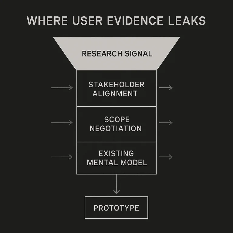
This article is about building prototypes where user research survives contact with the organization. For product designers, UX practitioners, and product managers who suspect their process is technically correct but structurally leaking.
What You’ll Learn
- Why prototypes diverge from research findings even when the research was good
- How to protect user evidence through organizational translation layers
- Where iteration adds value and where it becomes a substitute for conviction
- The structural conditions that make user-centric prototyping work — not the tools, but the decisions
What Is a User-Centric Prototype?
A user-centric prototype is a testable design artifact whose decisions are grounded in user research and refined through real user feedback. The distinguishing feature is not fidelity or polish—it is whether the design decisions trace back to observed user behavior rather than internal assumptions.
Most prototypes represent what a team thinks users need. User-centric prototypes represent what research has shown users actually do, want, and struggle with. That difference shapes everything: the questions you ask, the features you test, and the changes you make.
| Element | Content |
|---|---|
| Term | User-centric prototype |
| Plain definition | A testable design artifact whose decisions are grounded in user research and refined through user feedback |
| Why it matters | Prototypes built on assumptions produce products users tolerate; prototypes built on evidence produce products users choose |
| Common confusion | Often confused with high-fidelity design—user-centricity is about research grounding, not visual polish |
Key takeaway: A prototype can be a sketch or a fully interactive model. What makes it user-centric is whether the decisions behind it came from observation, not assumption.
How Does User Research Shape Prototype Direction?
User research answers the foundational question before design begins: what problem is this actually solving? Research methods—interviews, surveys, usability observations—provide the evidence base that separates informed design decisions from guesswork.
Interviews surface motivation and context. Deep listening during those interviews reveals why users do what they do, not just what they do. Surveys provide scale, identifying patterns across a larger population. Usability observations catch behavior that users themselves cannot articulate—the hesitations, the workarounds, the confusion they’ve learned to live with.
Two tools organize research findings into design inputs. Personas represent distinct user segments with enough specificity to guide decisions. Journey maps trace the user’s path through a process, marking where friction occurs and where expectation breaks down.
Example: In our work, a B2B software client kept surfacing the same research signal and kept ignoring it. Their navigation was organized around the company’s own org chart, with features grouped by the internal team that owned them. Interviews told a different story. Users described their work in terms of the outcomes they were chasing, while the structure mirrored the departments that built the tools. The team had watched the interview footage and still defended the existing structure, because it matched how they thought about their own product. More research didn’t move them. What did was a low-fidelity prototype that reorganized the same features around user tasks instead of internal ownership, tested with the same people who had given the original feedback. Watching users move through the task-based version without hesitation did what the readout deck couldn’t. The lesson we took from it: research rarely fails because it’s wrong. It fails because the organization’s existing mental model is louder than the evidence. The prototype’s real job was to make the user’s mental model visible enough that the team could no longer argue with it.
Key takeaways:
- Research identifies what to design before you decide how to design it
- Personas and journey maps translate raw research into usable design inputs
- The goal of user research is to surface the actual problem, not confirm the assumed one
Where Does Brand Strategy Fit Into Prototype Direction?
Most prototyping advice stops at usability. Can the user complete the task, find the feature, move through the flow without pausing. Those questions matter, and they are not the whole job. A prototype also decides what the product means to the person using it, and meaning is the part most teams never put on the table.
In our work, we treat a prototype as a brand signal. Every choice it sets in front of a user carries meaning: what gets prominence, what the interface calls things, what the flow assumes the user came to do. Those signals either agree with each other and with what the brand has already said elsewhere, or they pull apart. When they pull apart, users feel the dissonance before they can name it, and polish does not recover it. This is why strong research can still produce a weak prototype. The flow works, and it tells the user a different story than the rest of the brand does.
So before building, we run the prototype against three checks. We call it building for coherence: designing the artifact so its decisions agree with both observed user behavior and the brand’s stated point of view.
- The prototype tests meaning, not only mechanics. Before you ask whether users can complete a task, ask what completing it tells them about the product. A checkout that upsells at every step can test well on speed and still signal that the product is built to extract rather than to serve. Name the meaning each core decision carries, then test whether users read it the way the brand intends.
- Build to survive, not to validate. This is the rule for when to prototype and when to test live. Prototype when the gap is between the user’s mental model and the organization’s, when the team and the research disagree about what the product is for. A prototype’s real job there is to put the user’s model in front of the team in a form they cannot wave off. Test live when the gap is execution detail, the copy, the spacing, the wording of a label, where production data answers faster than a prototype can. Prototyping an execution question wastes a cycle. Testing a direction question live ships the disagreement to customers.
- Coherence is the pass condition. A prototype passes when its decisions agree with observed behavior and with what the brand means everywhere else. A usable flow that contradicts the brand’s point of view is a failure even when users finish the task, because the contradiction is the signal users keep. Hold coherence as the bar rather than a finishing touch, and you stop shipping flows that win the test and erode trust in the product.
This is the angle most prototyping guides skip. They treat the prototype as a usability instrument and stop there. Treated as a brand signal — an extension of the same design thinking approach that shapes brand communication — the prototype becomes the place where strategy and product either cohere or split, and the cheapest place to catch the split before it reaches a customer.
How Do You Involve Users Effectively in the Design Process?
User involvement should be continuous, not episodic. The teams that get the most from user participation distribute it across the design process—early for direction, middle for concept validation, late for refinement.
Early involvement uses low-fidelity formats: sketches, paper wireframes, simple click-through flows. Bill Buxton makes this case in Sketching User Experiences (2007): designers who prototype in low fidelity feel less attached to their first solution and more willing to revise based on test results. The format communicates concept without investing in execution. Users respond to the idea rather than the interface, giving feedback on direction before significant time is spent.
As the prototype gains fidelity, feedback shifts from concept to execution. Does this flow make sense? Is this terminology familiar? Does this interaction feel expected? These questions require a prototype close enough to the real product to provoke genuine reactions.
That said, fidelity is not the gate most teams assume it is. Walker, Takayama, and Landay found in a 2002 study published in the Proceedings of the Human Factors and Ergonomics Society that low- and high-fidelity prototypes surfaced the same usability issues — the findings were independent of medium and fidelity level. The practical implication: test when the prototype is ready, not when it looks ready.
Feedback collection methods include moderated usability sessions, unmoderated remote testing, workshops, and async annotation tools. The right method depends on what you need to learn. Moderated sessions reveal reasoning. Unmoderated testing reveals behavior at scale.
Common failure mode: Teams schedule a single round of user testing before launch. By that point, the design is close to final, the team is committed to the direction, and feedback that challenges core decisions is difficult to act on. Involve users early enough that their input can still change the design.
Key takeaways:
- Distribute user involvement across early, middle, and late prototype phases
- Match feedback method to the type of question you need to answer
- Early testing should be able to change the design direction, not just validate it
How Should You Iterate on a Prototype Based on Feedback?
Iteration is not revision. Revision is making changes. Iteration is a structured cycle of hypothesis, test, feedback, and update — the same iterative logic at the core of design thinking as a discipline — that moves the design progressively closer to user needs.
An effective iteration cycle has four components: a clear objective for each test (what question are you trying to answer?), a method for capturing feedback systematically, a process for prioritizing which feedback to act on, and a way to verify that changes actually addressed the issue.
Prioritizing feedback requires distinguishing between signal and noise. Feedback from users whose behavior matches your target persona carries more weight. Feedback that appears across multiple sessions on core workflows carries more weight than isolated reactions to peripheral details. These cycles do not require large participant pools. Jakob Nielsen and Thomas Landauer demonstrated in a 2000 study that five users typically surface around 85% of a product’s usability problems — making small, frequent tests more productive than infrequent large ones.
Rapid prototyping tools—Figma, Sketch, Adobe XD—support fast iteration cycles by enabling quick changes and real-time collaboration. The goal is to reduce the time between testing and implementing so that the prototype evolves in response to evidence rather than accumulating into a single high-stakes launch.
Best practice: Frame a testable question before each session, calibrated to the prototype’s stage. For early-stage concept prototypes: “Do users recognize this as a solution to [specific problem] within the first 30 seconds?” or “Which of these three navigation models matches how users describe their own workflow?” For mid-fidelity wireframes: “Can users complete [core task] in under 3 steps without using the back button?” or “Where do users pause or re-read during the onboarding sequence?” For high-fidelity interactive prototypes: “Does the revised checkout flow reduce abandonment at the payment step compared to the previous version?” or “Do users find and use the [new feature] without prompting?” Each question should name a specific behavior you can observe, a point in the flow where you will observe it, and a comparison baseline when one exists. If your question could apply to any product at any stage — “What do users think of this design?” — it is too vague to drive useful analysis.
Key takeaways:
- Structure iteration around testable questions, not versions
- Prioritize feedback from target users on core workflows
- Reduce the cycle time between testing and implementation
What Challenges Arise in User-Centric Prototyping, and How Do You Address Them?
The most persistent challenge is not collecting feedback—it is using it well. Teams often gather substantial user input and then struggle to act on it because the feedback is contradictory, the stakeholders are resistant, or the team has lost the thread between research and decision.
Three challenges come up consistently:
- Conflicting feedback. Users disagree with each other. When that happens, return to your personas. Conflicting feedback usually traces back to different user segments with genuinely different needs. Designing for one segment may mean explicitly choosing not to design for another.
- Stakeholder resistance. User research sometimes contradicts what stakeholders believe. The most effective response is data, not debate. Present findings clearly, connect them to business outcomes, and make the cost of ignoring research visible.
- Sustaining user engagement. Recruiting fresh participants for every test round burns time and introduces inconsistency. Build a standing panel instead. Recruit 20–30 participants who match your core personas, screened through a short qualifying survey (5–7 questions on demographics, product experience, and tech comfort). Compensate with $50–75 per 30-minute session — enough to respect their time, not so much it attracts professional survey-takers. Set a rotation rule: no participant tests more than once every 4–6 weeks to prevent learned behavior from contaminating results. Keep the panel engaged between sessions with a quarterly email update showing how their feedback shaped the product. Panel management tools like Great Question or User Interviews handle scheduling, screening, and incentive delivery — the overhead drops significantly after the first month.
Key takeaways:
- Treat conflicting feedback as a segmentation signal, not a problem to average out
- Connect user research findings to business outcomes when presenting to stakeholders
- Build a standing panel of 20–30 screened participants with $50–75 incentives and a 4–6 week rotation rule
How Do You Align Stakeholder Expectations With User Needs?
Stakeholder alignment is a communication problem as much as a design problem. Stakeholders often resist user research not because they disagree with the findings but because they haven’t been part of the process that produced them.
The most effective alignment strategy is structured observation. Pick two to three stakeholders per research session — enough to build shared context, few enough that the room doesn’t shift user behavior. Give each observer a role: one tracks task completion, one logs emotional reactions, one captures direct quotes. This keeps observers active instead of passive. After the session, run a 15-minute debrief with one question: what did you see that you didn’t expect? Collect responses in writing before opening group discussion — this prevents the loudest voice from overwriting quieter observations. Two sessions of structured observation will do more to align stakeholders than any research readout deck.
When alignment breaks down, diagnose before debating. Ask one question: is the stakeholder disputing what users said, or accepting it but prioritizing something else? If a VP of sales agrees users find the onboarding flow confusing but wants to keep the upsell screen because it drives 30% of trial conversions — that is a priorities conflict. The research is not in dispute. The team needs to negotiate tradeoffs, and both sides have legitimate claims. If that same VP insists users actually want product recommendations during onboarding despite session recordings showing them skipping past — that is an evidence conflict. The response is not negotiation. It is replaying the recordings, showing the skip rates, and tying the metric to a business outcome the stakeholder cares about. Conflating these two situations is where most stakeholder alignment conversations go sideways. Priorities conflicts need tradeoff frameworks. Evidence conflicts need data.
If the pattern repeats: If stakeholders consistently override user research, the design process lacks authority structures that protect user-centered decision-making. Fix the process, not just the individual conversation.
Key takeaways:
- Use structured observation: 2–3 stakeholders per session, assigned roles, written debrief before group discussion
- Diagnose whether a conflict is about priorities (legitimate tradeoff) or evidence (data should win) before deciding how to respond
- Process-level authority for user research prevents repeated ad hoc battles
Conclusion
User-centric prototyping is not a methodology that slows design down. Done well, it eliminates the costly rework that comes from building the wrong thing.
The three disciplines that make it work are straightforward: research that grounds decisions in observed behavior rather than assumed preference, user involvement distributed across the design process, and iteration structured around testable questions rather than aesthetic preferences.
Build your next prototype from what you know about users, not what you believe about them.